Triple H named Head of Talent Relations and Creative in WWE. 2023 WON Booker of the Year.

CBoz

We Are NXT!
Joined
Jun 16, 2013
Messages
54,992
Reputation
3,072
Daps
123,582
Reppin
The NXT Universe
This is much better but what can I do? :manny:

FxnYObqWIAAkQ09
 

CBoz

We Are NXT!
Joined
Jun 16, 2013
Messages
54,992
Reputation
3,072
Daps
123,582
Reppin
The NXT Universe
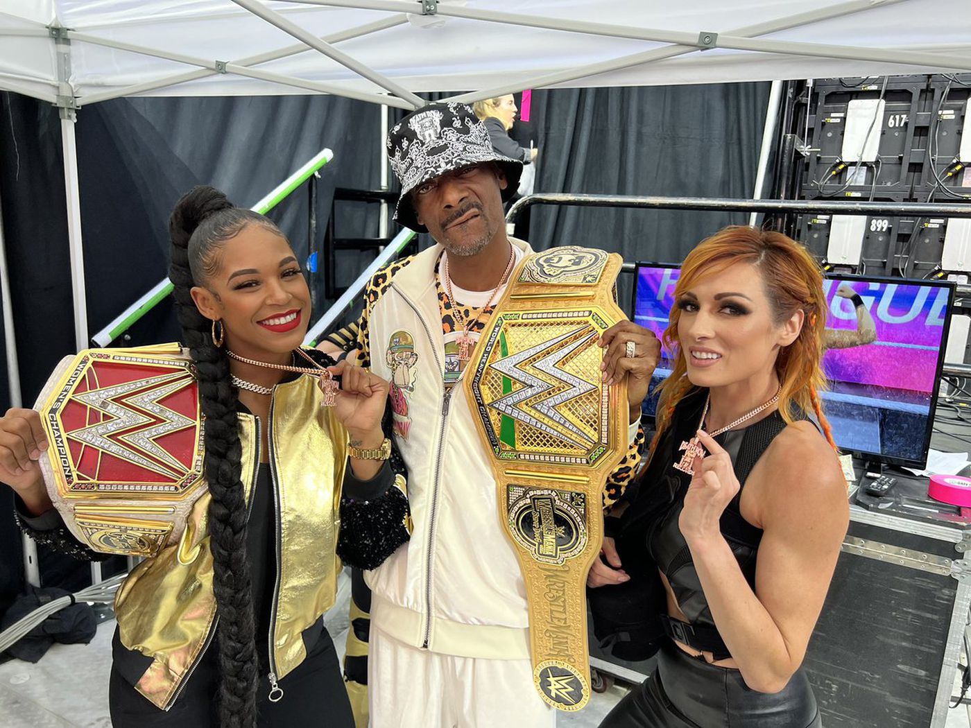
White diamonds on top of a gold background ain't that bad. I'm hoping they did lots of lighting tests to settle on black diamonds on the new title.

golden_belt_snoop1.jpg
 

Silkk

Thats My Quarterback :to:
Joined
May 2, 2012
Messages
190,716
Reputation
19,230
Daps
482,131
WWE needs to get better creatively/storylinewise outside of the bloodline though.

This mofo Austin Theory is just dead in the water with no momentum.

Seth is a lil corny faggit who hasn’t had an interesting feud since Riddle.


WWE needs another great whodunit storyline that can go for months imo.
 

drifter

Superstar
Joined
Dec 15, 2013
Messages
5,919
Reputation
2,943
Daps
22,092
This is much better but what can I do? :manny:
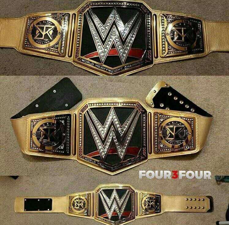
FxnYObqWIAAkQ09
For comparison

undisputed-wwe-universal-championship-replica-title-belt_ss5_p-200117186+pv-1+u-hc2lscoiijh0lgfxsswd+v-hc08vxw8u6qx6nbqhzlf.jpg


Here's a designer's opinion why the real belt is a much better design.

Colored straps will always be wild tacky unless white or another muted color (beige/brown). Any other colors (especially primary) and you distract from design. "But it's just a big W!". Yeah and your eye can't focus on it or the sideplates while they're absorbing the blue or red from the strap. Even though they're both Ws, WWE knows the WWE title was better for practicality and promotion than giving Mahomes the blue one even though it's been more important lately

The black plate on yours dominates the W and forces it to blend in which was the problem with the WWE title they just got rid of, it's dull and boring. This new one fixes that with the yellow/gold plate and black stones in the W instead of clear they've always used going back to the spinner. The contrast is sharp and the strap accents the stones/W instead of clashing. I think they missed on the side plates, they should have black stones for continuity but whatever

It reminds me of the spinner belt minus the obvious it doesn't spin, I think that's what they were going for. Seth's got the new age big gold, Roman the new age spinner. Seth's belt sucks though lol
 

Cattle Mutilation

Superstar
Joined
Dec 7, 2016
Messages
27,472
Reputation
1,226
Daps
42,443
undisputed-wwe-universal-championship-replica-title-belt_ss5_p-200117186+pv-1+u-hc2lscoiijh0lgfxsswd+v-hc08vxw8u6qx6nbqhzlf.jpg

undisputed-wwe-universal-championship-replica-title-belt_ss5_p-200117186+pv-2+u-hc2lscoiijh0lgfxsswd+v-axud5bq0pk2sb2qav8li.jpg

undisputed-wwe-universal-championship-replica-title-belt_ss5_p-200117186+pv-3+u-hc2lscoiijh0lgfxsswd+v-yicygbp3vgrx9nngeixi.jpg

FxqevxUXoAAzKTE

Definitely looks better on TV
I thought it looked considerably worse on TV. Though it looks pretty bad either way. Still looks like some generic shyt you'd find at Walmart.
 

CBoz

We Are NXT!
Joined
Jun 16, 2013
Messages
54,992
Reputation
3,072
Daps
123,582
Reppin
The NXT Universe
For comparison

undisputed-wwe-universal-championship-replica-title-belt_ss5_p-200117186+pv-1+u-hc2lscoiijh0lgfxsswd+v-hc08vxw8u6qx6nbqhzlf.jpg


Here's a designer's opinion why the real belt is a much better design.

Colored straps will always be wild tacky unless white or another muted color (beige/brown). Any other colors (especially primary) and you distract from design. "But it's just a big W!". Yeah and your eye can't focus on it or the sideplates while they're absorbing the blue or red from the strap. Even though they're both Ws, WWE knows the WWE title was better for practicality and promotion than giving Mahomes the blue one even though it's been more important lately

The black plate on yours dominates the W and forces it to blend in which was the problem with the WWE title they just got rid of, it's dull and boring. This new one fixes that with the yellow/gold plate and black stones in the W instead of clear they've always used going back to the spinner. The contrast is sharp and the strap accents the stones/W instead of clashing. I think they missed on the side plates, they should have black stones for continuity but whatever

It reminds me of the spinner belt minus the obvious it doesn't spin, I think that's what they were going for. Seth's got the new age big gold, Roman the new age spinner. Seth's belt sucks though lol
I don't hate this. I've always loved this design since the 2014 rebrand. I like the uniformity and clean/sleek look of it. Just like the Big Red Universal it will take time getting adjusted to. I admitted it looks better on TV than as a digital render and that is the real story. They likely created and tested all sorts of versions and tested it in various real life settings before choosing this design/color scheme, or at least I hope they did.

I'm actually curious what they do with the lineages more than being worried about this redesign. So far on WWE's title history page it's still two separate lineages, WWE and Universal title histories but it's still early in the process. Only time will tell what they do next.

Now let's hope they do something with the SD & Raw Women's titles being on opposite brands, the NXT Women's tag titles being on SD and maybe they do something about a WWE Tag Team title redesign, hopefully it being a 1 set of titles solution.
 
Last edited:
Top