You are using an out of date browser. It may not display this or other websites correctly.
You should upgrade or use an alternative browser.
You should upgrade or use an alternative browser.
[Official] Apple iPhone X:OUT NOW!
- Thread starter -DMP-
- Start date
More options
Who Replied?Thousand dollar phone........ 

so only 50 more than note 8 but we need 4 gigs of ram wtf
Illuminatos
#OVOXO
That price. 
How much is the regular 7S Plus gonna be?

How much is the regular 7S Plus gonna be?
Clark Wayne
Superstar
Depending on the storage, probably $769, $869, and $969.That price.
How much is the regular 7S Plus gonna be?
levitate
I love you, you know.
Depending on the storage, probably $769, $869, and $969.
But who's that in your profile pic, though?


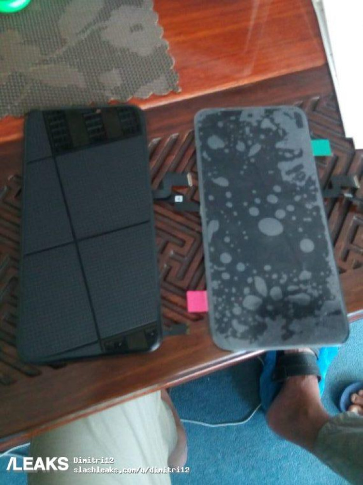
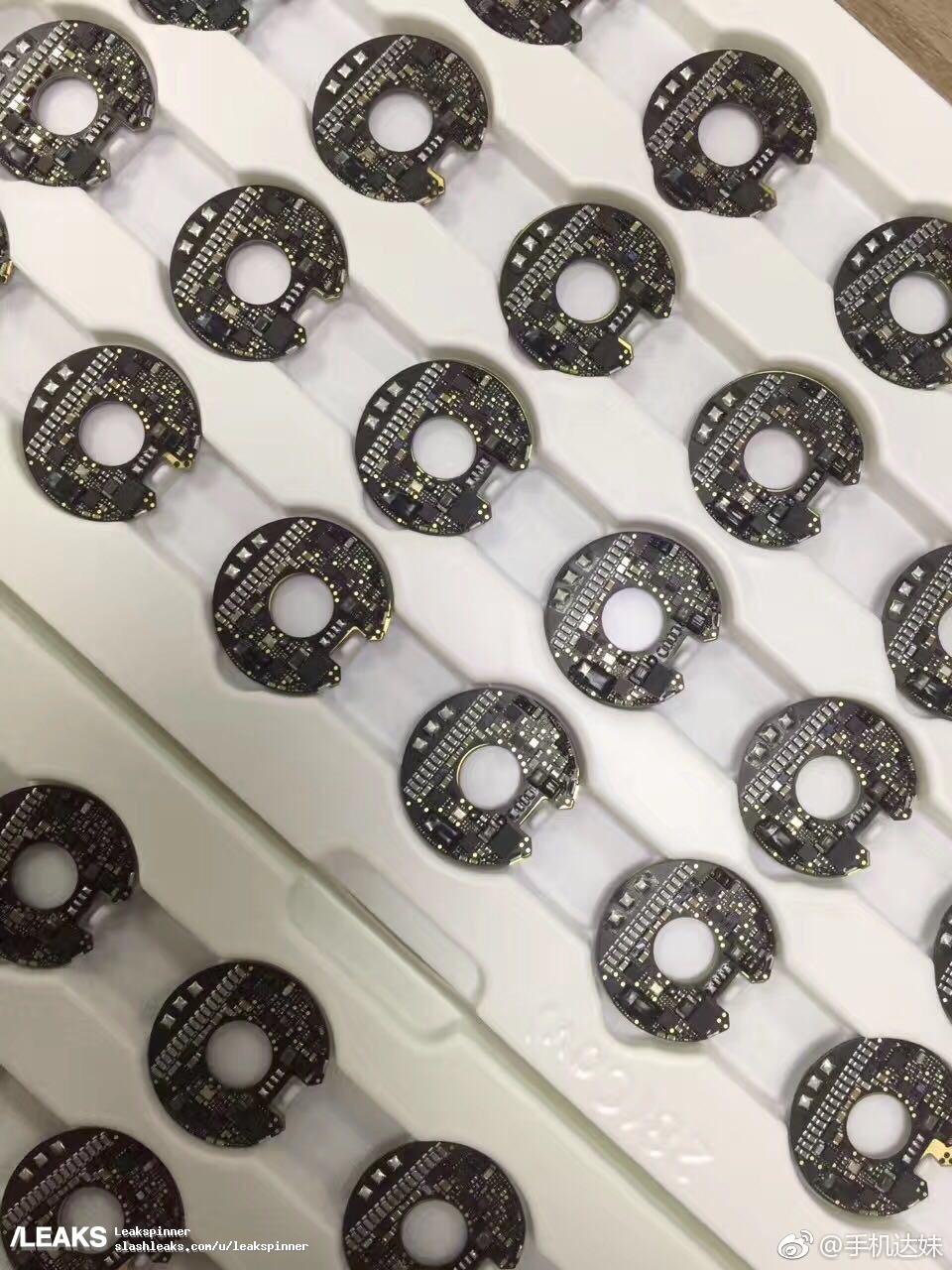
OLED Display assembly and wireless charging coils.
Clark Wayne
Superstar
Nah.Is there an 8 plus version?
Clark Wayne
Superstar
Illuminatos
#OVOXO
Hold up you can get 200 GBs of icloud storage a month for only 2.99 a month?


That's amazing.


Why the fukk would I need anything over a 32GB phone then?


That's amazing.


Why the fukk would I need anything over a 32GB phone then?

Clark Wayne
Superstar
How Apple Plans to Change the Way You Use the Next iPhone
Apple is preparing three new iPhones for debut next month. One of the models, a new high-end device, packs in enough changes to make it one of the biggest iPhone updates in the product’s decade-long history. With a crisper screen that takes up nearly the entire front, Apple has tested the complete removal of the home button—even a digital one—in favor of new gesture controls for tasks like going to the main app grid and opening multitasking, according to the people and the images.
In the new, high-end iPhone, Apple also plans a taller screen with rounded corners, a cutout at the top of the display for the camera and sensors, and new antenna locations, the images show. Apple often tests different designs and the details may differ from what the company ultimately releases. An Apple spokeswoman declined to comment.
Across the bottom of the screen there’s a thin, software bar in lieu of the home button. A user can drag it up to the middle of the screen to open the phone. When inside an app, a similar gesture starts multitasking. From here, users can continue to flick upwards to close the app and go back to the home screen. An animation in testing sucks the app back into its icon. The multitasking interface has been redesigned to appear like a series of standalone cards that can be swiped through, versus the stack of cards on current iPhones, the images show.
The new model’s overall size will be similar to that of the iPhone 7, but it will include an OLED screen that is slightly larger than the one on the iPhone 7 Plus (5.5-inches), people familiar with the product have told Bloomberg News. The phone will have symmetrical, slim bezels around the entirety of the screen, meaning the area below the screen that used to house the home button and the area above the screen for the earpiece have been removed. The earpiece, facial recognition sensor, and selfie camera are instead present in a cutout, or “notch,” at the top of the screen, the images show.
The new screen is rounded on the corners, while current iPhone screens have square corners. The power button on the right side of phone is longer so it is easier to press while holding the device in one hand, according to the images and the people.
The screen is also noticeably taller than the iPhone 7 Plus’s screen, meaning it could show more of a web page or additional text messages, the people said. The phone will still have six vertical rows of apps, showing 24 icons on each page, excluding the dock, a grey bar at the bottom that houses commonly used apps. The dock is redesigned with a new interface similar to the one on the iPad version of iOS 11, the images show.
Apple has opted to not hide the notch area at the top of the screen, showing a definitive cutout at the top of apps with non-black backgrounds. The cutout is noticeable during app usage in the middle of the very top of the screen, where the status bar (the area that shows cellular reception, the time, and battery life) would normally be placed, according to the images. Instead, the status bar will be split into left and right sides, which some Apple employees call “ears” internally. In images of recent test devices, the left side shows the time while the area on the right side of the notch displays cellular and Wi-Fi connectivity and remaining battery life. Because of limited space, the status bar could change based on the task at hand, according to a person familiar with the testing.
Last edited:
bruh I swear every time Im about to post an article you beat me to it

good looks
levitate
I love you, you know.
This breh still didn't tell me who's t*ts those were.

