Why I think NBA jerseys are being ruined

Goat poster

KANG LIFE
Joined
May 13, 2012
Messages
20,286
Reputation
3,789
Daps
88,838
Just going to say it.

Soccer (football) > Basketball jerseys

Yes, I know there are ads on them that are much bigger, but generally just think they look better.
Soccer has the best jerseys by far

They actually allow soccer clubs to be innovative and creative with they designs.

American sports jerseys are always bland

Especially the past 20 years
 

Remote

Veteran
Supporter
Joined
Aug 29, 2013
Messages
83,624
Reputation
25,993
Daps
375,399
I do like the old Charlotte Hornets jersey tho.


larry-johnson-mugsy-bogues-and-alonzo-mourning-of-the-charlotte-take-picture-id3042803
 

GoldenGlove

😐😑😶😑😐
Staff member
Supporter
Joined
May 1, 2012
Messages
61,421
Reputation
6,051
Daps
144,855
He elegantly explained the shift in the designs going from mascot/team name focused to city focused and still somehow misses why that would potentially translate to more sales.

More people are going to resonate with a city across a jersey than a team name.
 
Joined
May 1, 2012
Messages
73,748
Reputation
13,182
Daps
259,790
Reppin
206 & 734
Bruh you have a soccer oriented avi. You're bias is way too strong lol.

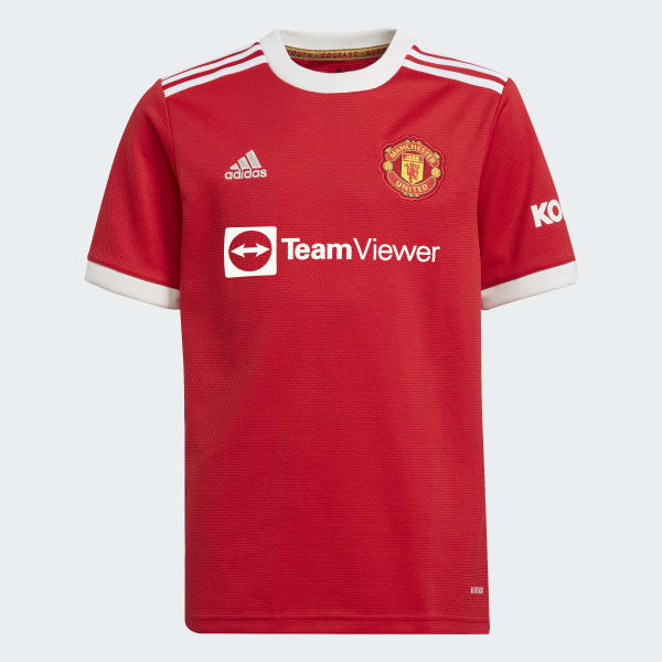
The problem with soccer jerseys (which you kind of acknowledged) is the ads are too damn big. Just look at this disgusting shyt. If I didn't know the name of the team, I would think they play for TeamViewer.
Manchester_United_21-22_Home_Jersey_Red_GR3778_01_laydown.jpg
At one point as a youngin I literally thought Fly Emirates was a team.
 

Killer Instinct

To live in hearts we leave behind is to never die.
Supporter
Joined
May 1, 2012
Messages
36,466
Reputation
14,033
Daps
170,231
Reppin
LWO
They ruined the Lakers jerseys with the banana yellow. I used to feel like I was watching royalty when the gold jerseys were at home. If it aint broke, don't fix it. Barring a few exceptions, the jerseys leauge wide from '95 - '12 were infinitely better than the bullshyt they're pumping out now. Don't care what any of you Joe Cool New School negros say.
 

Ozymandeas

Veteran
Joined
Jan 28, 2013
Messages
17,077
Reputation
3,212
Daps
79,518
Reppin
NULL
I agree. I noticed it on 2K. The away teams say the City name and the home teams say the Mascot name.

There's no creativity whatsoever.
 

Volt

All Star
Joined
May 24, 2022
Messages
1,659
Reputation
441
Daps
4,643
Reppin
Rio
The biggest problem is that there's too little variance imo.

If the minimalist designs were kept mainly for the away jerseys, they could try to be a bit more flexible with the main and city ones.

Like for example, this bullshyt right here:
FQ6NinjXMAArYRQ.png


Straight up palette swap status. The lack of trim lines makes them even worse. I'm not sure they even kept the design over how badly it was received or something. fukk Utah anyway. :pachaha:

With most teams in the league running similar-ish designs, the problem just gets even worse.

This ain't even minimalistic design, it's just barebones. This is what a good example of minimalistic design looks like:
8281171a34.jpg
 

Ribbs

Veteran
Joined
May 25, 2015
Messages
22,614
Reputation
4,042
Daps
90,280
Reppin
Toronto
Feels like every corporation from fast food to fashion to now sports have been going the minimalist route for the last few years.

 
Top