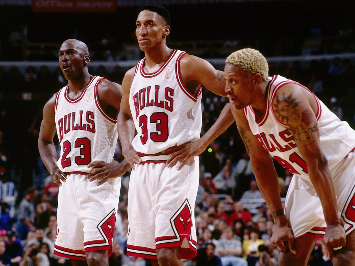
Some of those jerseys in the 90's were terrible though

You are using an out of date browser. It may not display this or other websites correctly.
You should upgrade or use an alternative browser.
You should upgrade or use an alternative browser.
Why I think NBA jerseys are being ruined
- Thread starter Doobie Doo
- Start date
More options
Who Replied?that white Atlanta jersey is dope asfHawks minimalist uniforms are clean as hell especially in person

InGodWeTrust
Tall & Handsome in ATL
Cavs fan here.
Not sure.
We just need the 80s navy/orange Cavs hoop logo in wine and gold FFS.
Not sure.
We just need the 80s navy/orange Cavs hoop logo in wine and gold FFS.
It took Atlanta too long to get that shyt right... 
i think the fan photoshops with the correct colors during the Joe Johnson era delayed em..
they was like ohh thats the colors yall want? fukk you we know whats best for yall
i think the fan photoshops with the correct colors during the Joe Johnson era delayed em..
they was like ohh thats the colors yall want? fukk you we know whats best for yall
InGodWeTrust
Tall & Handsome in ATL
Atlanta has the colors but yall need Pac-Man
Goat poster
KANG LIFE
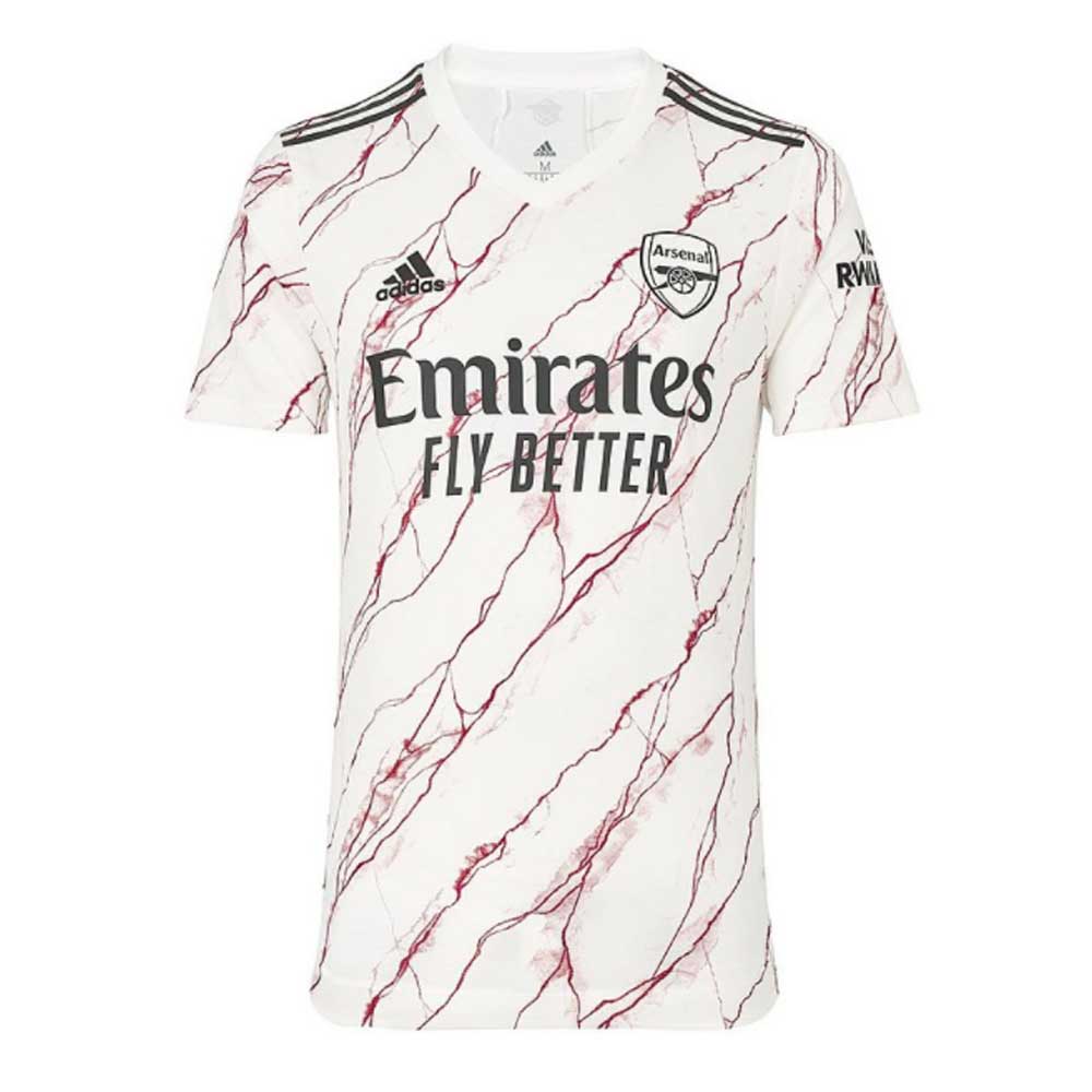
I’m an artistic dude so I love that shytHow creative can you be with a giant ass Emirates Fly Better plastered on the chest. That shyt looks awful. Do they sell jerseys without the ad?
One of thing I don’t like about soccer joints is that the away colors seem to change all the time. One year a team is wearing green then the next year it’s baby blue. Wtf!
Even down to youth soccer the jerseys just be better on a regular basis.
My sons soccer team got some FIRE jerseys
Some of the jerseys of the 90s were and are still hideous. Everyone hated the Pistons teal, and the Rockets cartoon..and they're still ugly. However, designers took chances...some worked, a few didn't, and a few were just unnecessary (purple Hornets, pinstripe Bulls).
With these current jerseys, creativity is being stifled or nonexistent and these design teams seem to be using default templates.
With these current jerseys, creativity is being stifled or nonexistent and these design teams seem to be using default templates.
How creative can you be with a giant ass Emirates Fly Better plastered on the chest. That shyt looks awful. Do they sell jerseys without the ad?
One of thing I don’t like about soccer joints is that the away colors seem to change all the time. One year a team is wearing green then the next year it’s baby blue. Wtf!
I get people not liking the "Emirates Fly Better" or whatever the sponsor might be on the front. A good club and sponsor know not to ruin the jersey with something too obnoxious and big.
As to how creative you can be? Personally I think these are all unique and creative. The sponsor doesn't ruin them to me.

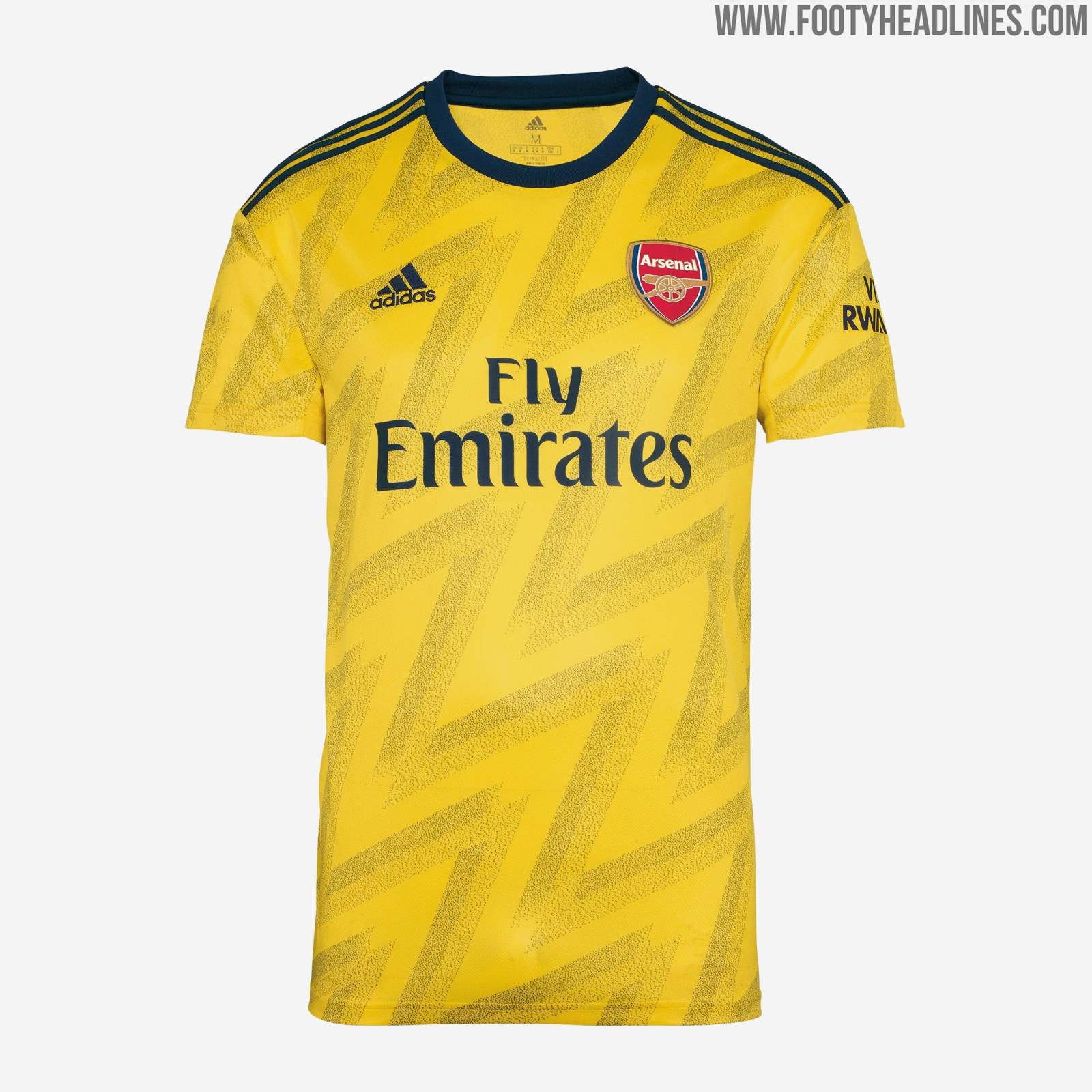

As for the away and 3rd jerseys changing colors. I can see how people might not like that, but personally I love it. It gives fans a chance to get something new and different. Those away jerseys usually are more memorable when your team has a good year. They become recognizable and have stories attached to them unlike the Home/1st jersey that is almost the same every year.
Last edited:
areohbee824
Superstar
Hawks minimalist uniforms are clean as hell especially in person
The black one is my favorite out of those 3
Pure Water
Veteran
Ima keep it real. They look tacky.I get people not liking the "Emirates Fly Better" or whatever the sponsor might be on the front. A good club and sponsor know not to ruin the jersey with something too obnoxious and big.
As to how creative you can be? Personally I think these are all unique and creative. The sponsor doesn't ruin them to me.
As for the away and 3rd jerseys changing colors. I can see how people might not like that, but personally I love it. It gives fans a chance to get something new and different. Those away jerseys usually are more memorable when your team has a good year. They become recognizable and have stories attached to them unlike the Home/1st jersey that is almost the same every year.
KFBF
Superstar
I feel like the cut of the jerseys has changed too dramatically as well.
Vs
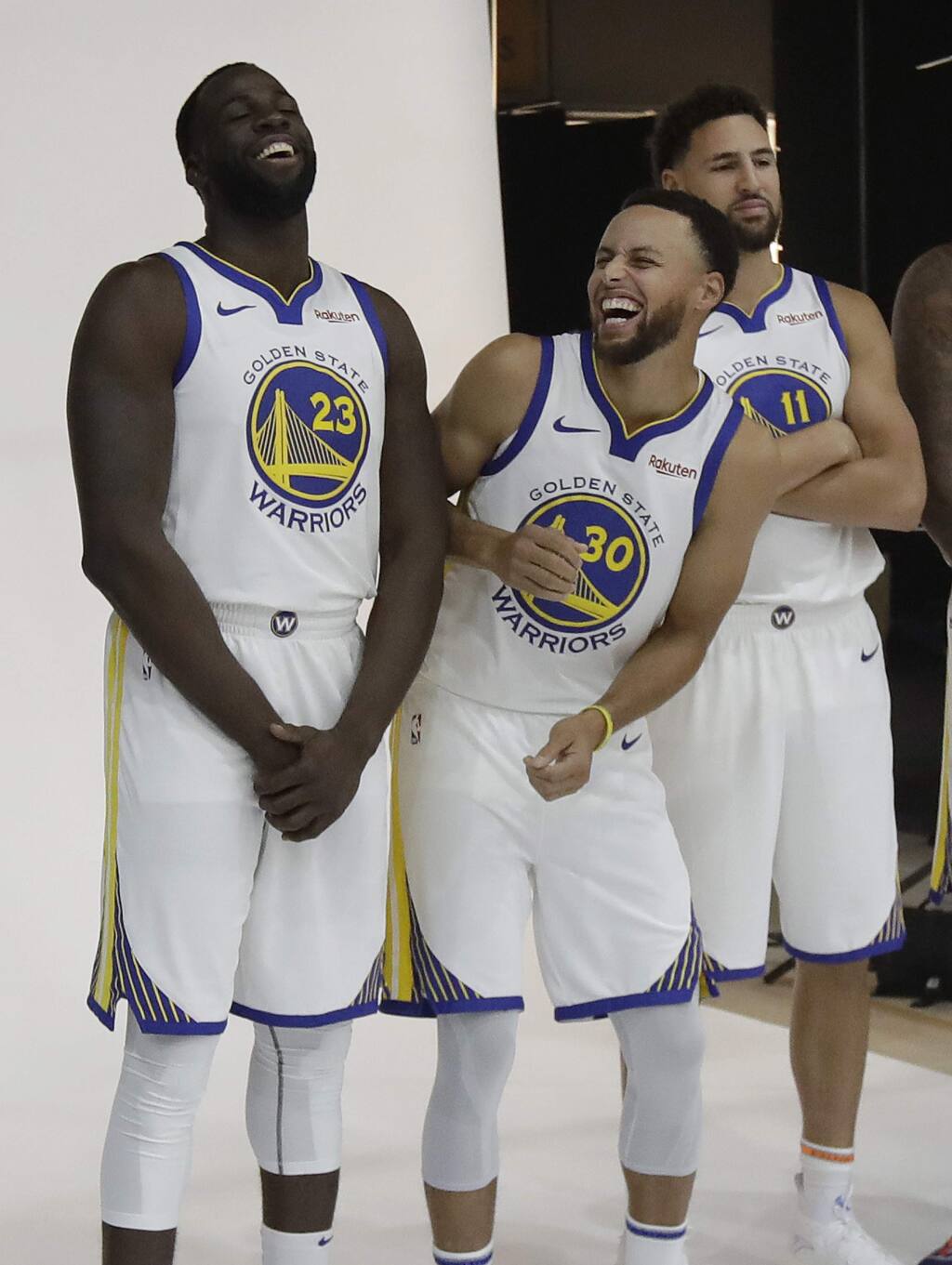
The warriors vneck bullshyt looks like a wnba jersey
Vs
The warriors vneck bullshyt looks like a wnba jersey