Well, I see you're using the Andrew Loomis method of measuring the body, which you should do, but it's usually 8 head lengths down to the bottom of the foot, you stopped at the ankle so the limbs are a little long; not to the point were it looks unnatural, but I wasn't sure if this was intentional so I thought I should point it out. There are a few anatomy issues with the hands,ankles,feet ( they can be tough to draw, I know) that make them look off, and the pose is a little stiff; Look into gesture drawing to help make your pictures a little looser and more natural.It can really help:
(The BEST guy to get advice from on youtube, if your into sketching/drawing from life.)
Also, I use this site to use references from for gesture drawing, since it's easier than finding a bunch in real life:
http://artists.pixelovely.com/practice-tools/figure-drawing/
And when you're laying down colors, you should lay down flat colors at full opacity (I assume you're doing this in photoshop ), then you can lower the opacity some to shade and blend. Although,working with a low opacity can produce some interesting,water color type results imo, it can create some issues if you want to push the image further.
Well the limbs are supposed to look long, that's how I'm drawing my elf characters (they have longer bodies than humans).
But other than that, I also thought the pose was awkward and yes feet and hands are the toughest to draw.
As for the program, I'm using sketchbook pro.
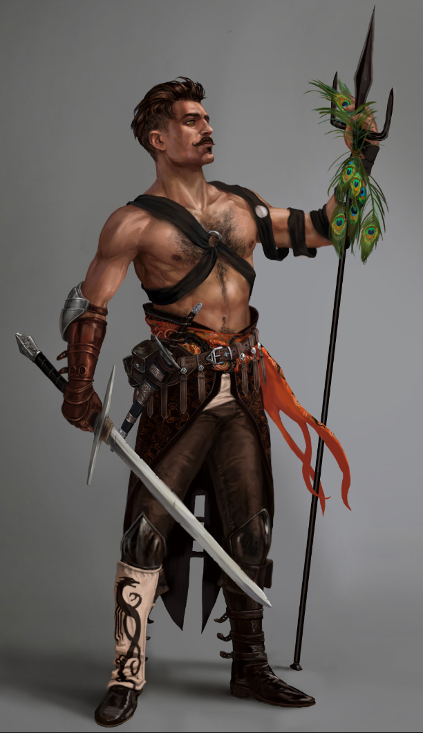
I want to get my drawings to this level

because I want to be a character designer for video games.


