wet landscapes
ghost
you ain't my daddyI mean I deleted them from imgurLemme see about a reup
You going to get enough of pointing that finger at me

you ain't my daddyI mean I deleted them from imgurLemme see about a reup
You going to get enough of pointing that finger at me

I found one, the other is lost in the etheryou ain't my daddy


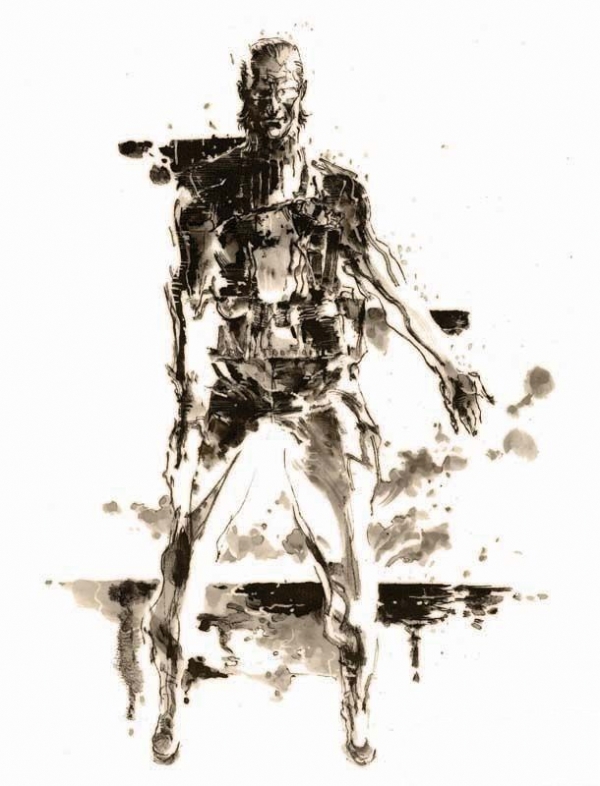
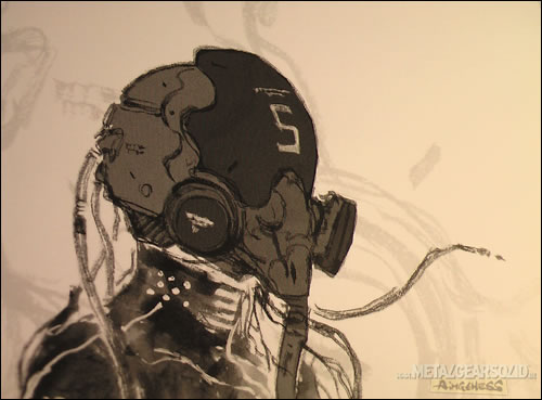
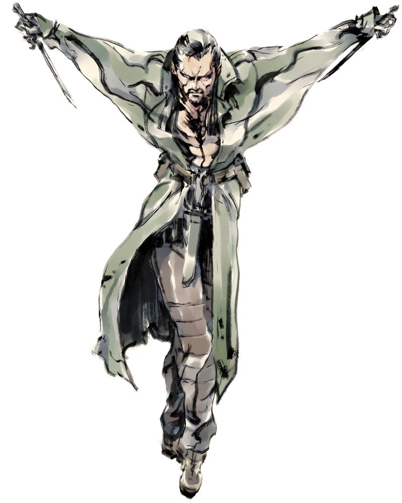
 - http://en.calameo.com/read/000607478ec78db1e4082
that's the MGS artist, right?I found one, the other is lost in the ether
Also Yoji Shinkawa


Heres some more I couldnt link or save- http://en.calameo.com/read/000607478ec78db1e4082

No the Mario artistthat's the MGS artist, right?

No the Mario artist

so cool that you can paint freely without needing lines
This is my first time doing itso cool that you can paint freely without needing lines
Your first huh:saywordtho:This is my first time doing it


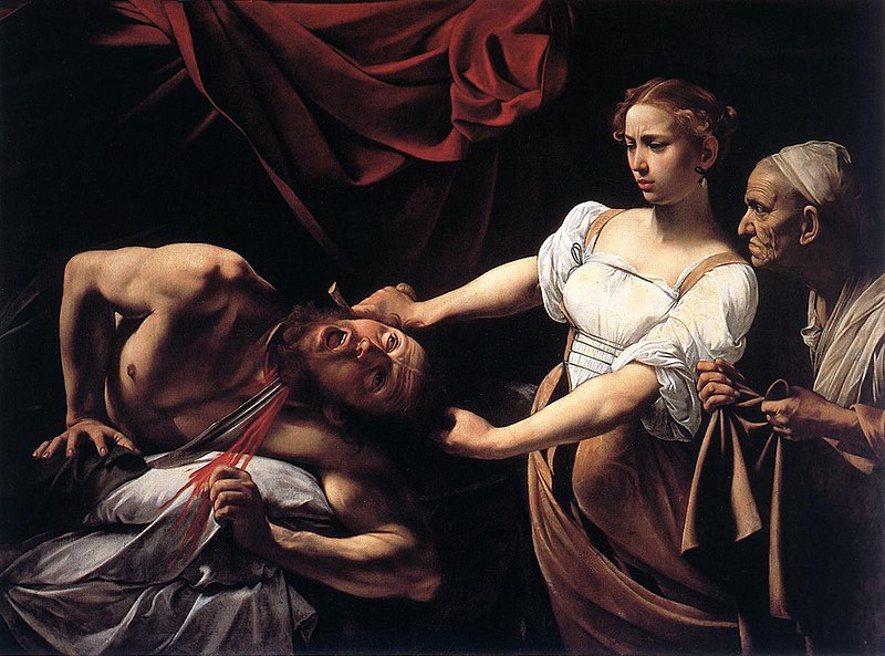
.jpg)
I like what you're doing so far, mind if I give you a couple critiques

1010's murals!!


dap+repI like what you're doing so far, mind if I give you a couple critiques
shyt like this is so cool, it really feels like you can go through the walls on some Wile E. Coyote shyt
In a way though, a lot of portrait/concept art is kind of an optical illusion too, though on a lesser scale than in these pics.In most art that attempts to imitate life in any sort of meaningful way, you're trying to simulate depth that isn't really there through use of value, color, and contrast, to build something sort of believable.

I would love some critiquesI like what you're doing so far, mind if I give you a couple critiques
shyt like this is so cool, it really feels like you can go through the walls on some Wile E. Coyote shyt
In a way though, a lot of portrait/concept art is kind of an optical illusion too, though on a lesser scale than in these pics.In most art that attempts to imitate life in any sort of meaningful way, you're trying to simulate depth that isn't really there through use of value, color, and contrast, to build something sort of believable.
Well, I see you're using the Andrew Loomis method of measuring the body, which you should do, but it's usually 8 head lengths down to the bottom of the foot, you stopped at the ankle so the limbs are a little long; not to the point were it looks unnatural, but I wasn't sure if this was intentional so I thought I should point it out. There are a few anatomy issues with the hands,ankles,feet ( they can be tough to draw, I knowI would love some critiques
 ) that make them look off, and the pose is a little stiff; Look into gesture drawing to help make your pictures a little looser and more natural.It can really help: