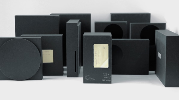
Around five designers worked with eight engineers, imagining processors that didn’t even exist yet. The design team began making foam mockups, with different shapes dependent upon the next Xbox’s internal architecture.
[Photo: Microsoft]
Seeing the dusty charcoal models, one looks like a stock Xbox One. Another resembles a record player. Still another looks like a misshapen pizza box. Consoles tend to be large but flat. This is because they are built with a single motherboard on the bottom, stacked with processors and cooling systems on top.
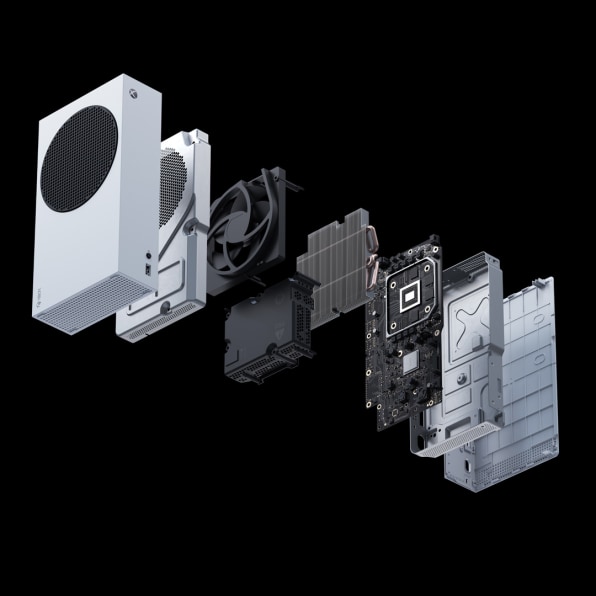
The engineering team had the notion, however, that the next Xbox could split the motherboard into two pieces (incidentally, the
folding Motorola Razr remake launched in 2019 does the same thing). Such an architecture could fit inside a box that was thicker but less wide, kind of like we already see in hulking tower PCs. A single tornado of air could spin up through its center to cool the chips—which in turn would be able to produce 12 teraflops of processing power (2 teraflops more than the upcoming PS5). Little surprise, this mockup was dubbed “Tower,” according to Chris Kujawski, the Microsoft design principal who led the Xbox project.
[Photo: Microsoft]
“Eventually we get to the point where we have to make a decision. These will generally all work . . . we know they’ll cost about the same. But what we really wanna know is whether this is exciting and interesting to customers,” says Kujawski. So small teams of designers and user researchers took these models into customers’ homes in L.A., New York, and Chicago.
“We’d line up 10-12 in home visits. We talk about gaming in general, how they use their console, high-level stuff . . . then we always took measurements of their room, how far they sat from the TV, and temperature readings for a thermal study,” says Kujawski. “Then we’d unveil these crude boxes . . . without much context other than, if this were the shape of the next-gen console, what do you think?”
The tower won. Not just because its monolithic design was visually compelling, but because of proportions that are more practical than you might expect. It’s a big box in your hands, yes, akin to the size of a commercial toaster. But because it’s not extreme in any one dimension, it can fit on a shelf that’s a mere 8-inches deep.
As Microsoft began to move forward with that design, the team also knew it wanted to create a less expensive version. As Spencer explains, having the most powerful console is key to the brand, but Xbox’s new customers tend to favor the less expensive permutations. These are generally released later in the console life cycle, but Microsoft wanted to offer it on day one.
Working from the Tower design, the team mocked up a form dubbed “Slice.” It had the same height and width as the Tower, but much less depth without features like a disc drive—it was as if the Slice was cut off the side of the Tower.
The Tower became the Xbox Series X. The Slice became the Xbox Series S. But especially within these minimal designs, the details mattered. And Microsoft chose to highlight a surprising detail of the industrial design as the console’s hero: the venting.
[Photo: Microsoft]
The art of the vent
Microsoft’s design philosophy around the Xbox is dubbed “intelligent geometry.” “You start with pure forms and reveal personality through functionality,” explains Kujawski.
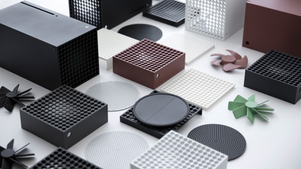
What that equates to in a practical sense is a visual language of squares and circles. Components like disc drives are boxes. There’s no way around that. Fans are circles. There’s no way around that, either. Instead of putting sculptural curves on the consoles to mask these components, Microsoft revealed personality through their functional shape.
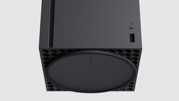
That meant that the fan, and venting, became the star attraction. Given that the vents are 60% air, the Xbox consoles are essentially a celebration of negative space.
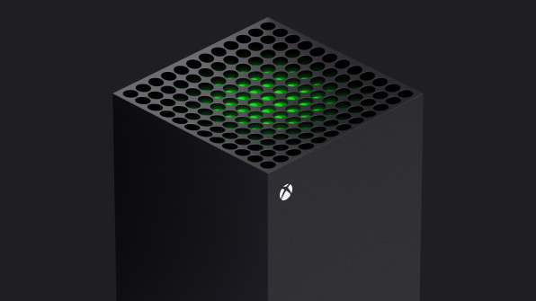
On the Series X, the vent is a stunning optical illusion. With a thicker perimeter than inside, it sinks into the box like a small depression. But the venting is actually stacked in two layers—the outermost is black, and the innermost is green. That means as your eye scans over the console, the green ripples and reveals itself, like a visual Easter egg. As Erika Kelter, senior
CMF designer with Microsoft, explains, this is the “second read” of the device, which “invites you to come closer and explore.” It’s just two layers of plastic, and yet, it looks electric. And if you have enough light, you can even see the fan, too.
[Photo: Microsoft]
On the Series S, designers worked hard to get the fan in just the right spot to give the entire console visual balance. For the grate on top, they debated different colors, but actually landed on contrasting the white box with a black vent as a means to simplify the look. “Which is counterintuitive,” Kujawski admits. “If you make the thing one color, you might think it’s simple. But [by adding black] we mask the hundreds of small holes here.” One big black circle is easier on the eye than countless tiny ones.
The Series S, in particular, will look quite familiar to anyone who has studied the work of renowned industrial designer Dieter Rams, namely his midcentury work at Braun (like
his 1958 L 2 speaker). Gary Hustwit, a documentarian who
made a whole movie about Rams,
spotted the similarity as quickly as we did—suggesting it was so similar that the S had to be an homage.
[Photo: Microsoft]
“We certainly talked about it at the time—this feels a little Braun, is that a good thing or bad thing. But that was the extent of the conversation,” says Kujawski. “We certainly never set out to design something that looked like a Dieter Rams product. The result is [from] probably following many of the same principles.”
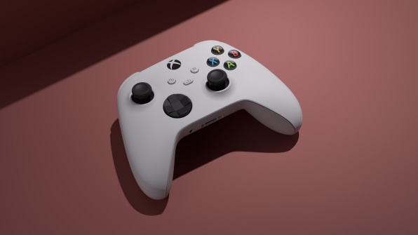
The final, major piece of design work was done around the Xbox’s controller. In order to reach a wider audience (namely of younger players with small hands), the design team wanted to tweak the shape of the controller, but without tens of millions of customers losing their muscle memory. And so after lots of testing—players invited into the design studio, trying prototypes while being studied closely—the team came up with a refined design. Among the tiny adjustments were shaving roughly a millimeter off each of the controller’s front shoulders and integrating the top triggers as a more continuous curve.
Whereas the former design fit the 5th to 95th percentile of hand sizes, the new design fits the 3rd to 95th percentile of hand sizes. “The result we want is that you pick it up and don’t know it’s different . . . but for someone younger to pick it up and feel it’s easier,” explains Kujawski.
[Photo: Microsoft]
The future of Xbox is not just the Xbox
But perhaps the most radical design decision around these new boxes has to do with the business plan. Yes, the Series X is $500 and the Series S is $300. However, taking inspiration from the smartphone industry, Microsoft is offering a 0% installment plan that also incentivizes players to sign up for its Netflix of gaming, Game Pass.
Through these plans that are bundled with a variant of Game Pass, you can buy a Series X for $35/month for two years, or an S for $25/month for two years.
So which piece of the Xbox business is profitable for Microsoft? Is it the hardware? The software licensing for games that want to be on the Xbox? The subscription services like Game Pass? These are breakdowns that Microsoft doesn’t share, but Spencer implies that Game Pass, while key to the company’s long-term strategy, is not maximized for profit today.
Microsoft understands that the Xbox business is much larger than the Xbox console itself, and its latest generation of hardware is just one component in the ever-growing world of gaming.
“Microsoft is in the gaming business for the long run, we want to be a platform where hundreds of millions or billions of players can find somewhere to play,” says Spencer. “Building walls around Xbox, so the only way you can continue the experience you love is to buy a new console this fall—for us, it doesn’t seem in line with the values we have as a team.”


