still with that terrible design
Would have been perfect too since two ABA teams were playing in the NBA Finals
Last edited:
 still with that terrible design
Play with Sith Lords brehsY’all expect any better from Comissioner Nosferatu?


Actually, the Nets' logo doesn't look that far off; just unbolded and "Nets" is center justified.And now that sportslogos.com April Fools joke makes sense to me. They changed every NBA team logo to just that text style but in the team colors


Would have been perfect too since two ABA teams were playing in the NBA Finals

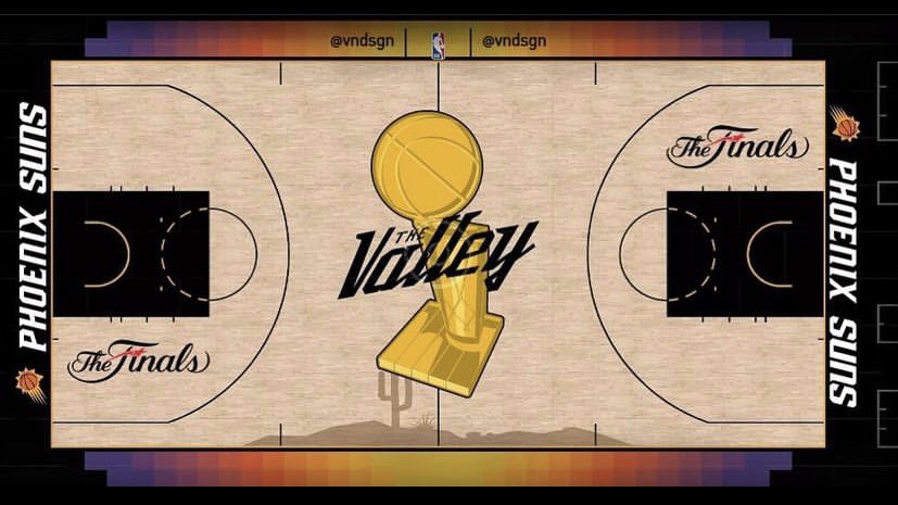
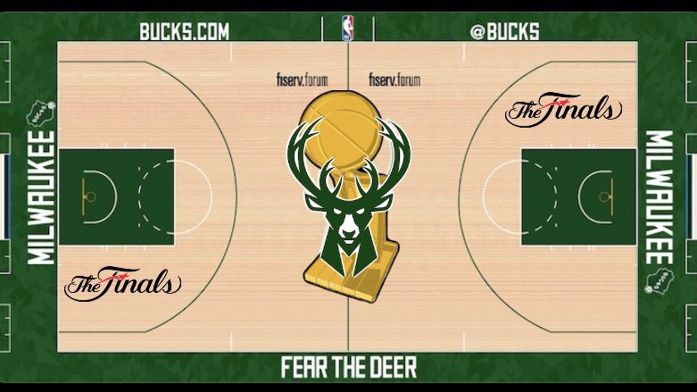
Such a damn shame they aren’t doing this
shyt look hard as fukk smh

Cmon bruh, u know what I mean