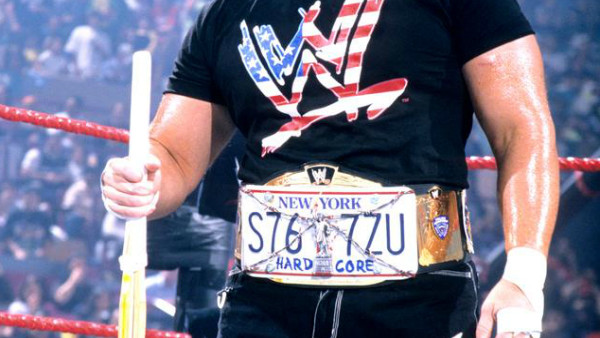
The hardcore title to me, should look ugly as fukk. Granted, the OG Hardcore title was ugly in a fashionable way, it personified the division to a T. Although Dreamer’s seems like a NY tribute belt, which in the time following 9/11 when that design was around, I get it.
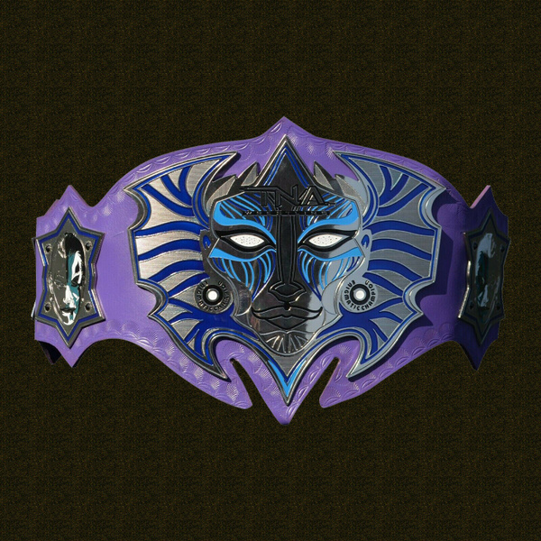
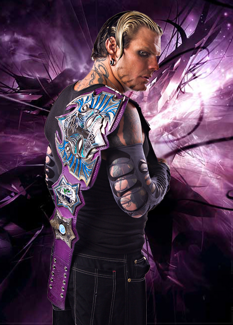
And I get Hardy’s design too, an egomaniacal vain artist who needs his own work of art to be the main prize. It worked with the gimmick. But objectively as a wrasslin title, it’s fugly as fukk. It’s got hard edges, weird emblems and designs, and purple doesn’t work as a main strap color.
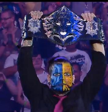
He had another belt later on as a face after he beat Aries which looked slightly better
but we’re not voting on that one, we’re voting on this one and it’s worse than Dreamer’s belt IMO


