Who has the hottest logo in sports

Tony D'Amato

It's all about the inches
Joined
May 1, 2012
Messages
62,617
Reputation
-10,857
Daps
149,085
Reppin
Inches
For the Washington huskies, imagine the purple part of his neck is the inside of the dogs MOUTH and its actually wide open growling or howling

Might be easier to see here

washington_huskies.png
What would be the point of having something growl w/o illustrating teeth :jbhmm:

A toothless dog isnt intimidating :francis:

And when I look @ the history of their logo, the dog is always chill

e79lygg8asfnquu7htm4.png


UW-logos-updated5.jpg


Wack logo regardless :dame:
 

Rick Roller 10

All Star
Joined
May 20, 2012
Messages
4,086
Reputation
1,090
Daps
10,773
Im not feeling that Raiders logo.. it must be a west coast thing..:yeshrug:


Edit : i know what it is.. its that Black/white color scheme.... its basic AF to me

I feel the same way about the Nets..idk what.:scusthov: Was thinking

The Sox is just a classic tho:smugbiden:
It's silver and black breh
 

Bryan Danielson

Jmare007 x Bryan Danielson x JLova = King Ghidorah
Joined
May 16, 2012
Messages
102,217
Reputation
9,293
Daps
199,674
Reppin
#We Are The Flash #DOOMSET #LukeCageSet #NEWLWO
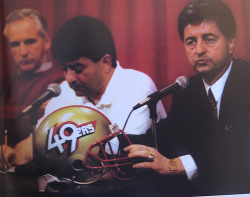
Niners logo..... It's timeless

It's classic.... It's bigger than the league shield! :blessed:


The way those colors beautifully work together!! I mean some high level Pantone selecting!:wow:

The perfect execution of the curves!:takedat:

The second to none typography of the initials!:ohlawd:

@Rekkapryde @JLova @dora_da_destroyer @yseJ @Dat916nikka @Reggie Rhodes @Jmare007 @FaTaL @Thief's Theme

Our squad by far has the ultimate logo! Don't even need to post it yall all know what it looks like!:umad:

The personification of "The Gold Standard":salute:
 

Tony D'Amato

It's all about the inches
Joined
May 1, 2012
Messages
62,617
Reputation
-10,857
Daps
149,085
Reppin
Inches
Niners logo..... It's timeless

It's classic.... It's bigger than the league shield! :blessed:


The way those colors beautifully work together!! I mean some high level Pantone selecting!:wow:

The perfect execution of the curves!:takedat:

The second to none typography of the initials!:ohlawd:

@Rekkapryde @JLova @dora_da_destroyer @yseJ @Dat916nikka @Reggie Rhodes @Jmare007 @FaTaL @Thief's Theme

Our squad by far has the ultimate logo! Don't even need to post it yall all know what it looks like!:umad:

The personification of "The Gold Standard":salute:
Ballmer should do what yall did in the 90s

1004.gif

3348758387_3e1efcb3bc.jpg


Throw a sh1tty logo away.
 

NZA

LOL
Joined
May 3, 2012
Messages
22,034
Reputation
4,120
Daps
56,532
Reppin
Run Thru U Like Skattebo
to me, nothing is better than really old logos. dudes with baseball heads, entire drawings of objects crammed into the text. you gotta love it

but some of these new ones are pretty good. that new atlanta hawks is nice
 
Top