
love these

Mighty ducks logo is the GOAT NHL logo and team. It might be 90s baby bias but it's up there with the Raiders, Bulls, Yankees in terms of iconic logos IMO

Sicc...logos and jerseys are the illest thing about pro hockey.
As a person who is gang-adjacent, I always wondered by Bloods never wore Calgary Flames attire...
Mighty ducks logo is the GOAT NHL logo and team. It might be 90s baby bias but it's up there with the Raiders, Bulls, Yankees in terms of iconic logos IMO
 no shyt
Because of the CSicc...logos and jerseys are the illest thing about pro hockey.
As a person who is gang-adjacent, I always wondered by Bloods never wore Calgary Flames attire...


I'd assume because back in the day getting a Calgary Flames jersey in LA wasn't that easy. Also the extra large C for the logo might not have been a good look?
Because of the C
This (maybe along with the old Whalers' one) is almost the NHL's answer to the Brewers' "glove" logo. First time I ever saw it I was like,It appears to be jumping out of a wave (aggressively).
I actually like that logo. As well as this and it's simplicity. Looks pretty good on a jersey.
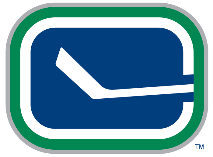
 ... could you be any less creative? Then you see the rink and the stick forming the "C", and it's
  . Plus, and I'm not sure it was the intent, the stick itself looks like a kind of (very) abstract "V".


