Playaz Eyez
Veteran
Countdown from three go press x to reload
Ol weak soft ass shyt
 may as well have Taylor Swift or Moby make some garbage for them
Countdown from three go press x to reload
may as well have Taylor Swift or Moby make some garbage for them
Ol weak soft ass shyt


 looks like they used a unpaid intern to make this shyt that w in raw is fukking horible
hopefully this includes new sets and new intro song
tonight is the night
Maybe they can try a old school smack down and bring it back for a night would be something different.A bit meh on RAW, SD looks crispHoping they also update the Smackdown set
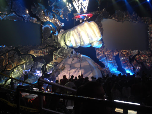
I understand that hauling the big fist around costed them a lot of money, but just imagine if they brought it back
You dont understand the RAW, the W is interchangeable, it can be turned to M for mini, and it can be turmed to W for Wumbo
 Dap plus rep.
