The_Dread_Dormammu
All Star
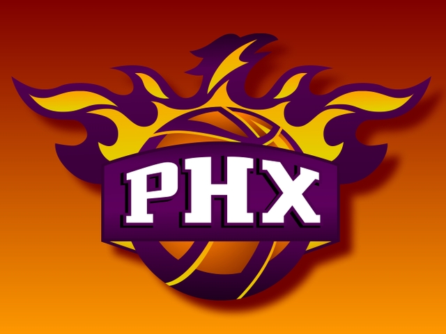
How they not include this Phoenix logo... ?

Explanation behind Portland's logo:

Yeah, that formula they had for a while was triddash. Thankfully the 2010s saw a return to classic logos and remixesmid 90's to early 2000's loud ass logos were wack af
mid 90's to early 2000's loud ass logos were wack af


That's my biggest gripe with a lot of the current logos. Too sterile and too clean; there's no fun or soul.
SEVEN of them are a circle with the team name on the edges and the logo on the inside: Atlanta, Denver, Indy, Minnesota, Philly, Washington and Toronto.
The best/iconic ones have had minimal changes over the years. Bulls, Celtics, Heat, Knicks and Lakers being the main ones. Both of Utah's logos were fire; Portland's primary logo has always been great but I don't like the current wordmark with it; San Antonio has a classic logo but the font on the current one isTotally fukked it up; way too clean. Phoenix has a solid logo but I hate the current color scheme. Doesn't look right at all. Detroit is clean in a good way.
Besides Golden State (all their changes actually looked good besides the We Believe one), I don't think any of the teams who have been changing their logos has a better look than one of their older ones.
- Nets is blah
- Hornets is not even close to the original logo
- Cavs is OK but I think the '83-93 and LeBron era Cavs ones are much better
- Mavs iscompared to their originals
- Clippers
- Original Grizzlies logo was awesome; current one is meh
- Bucks isn't bad but I prefer the previous ones
- T'Wolves is the worst of their logos; the KG era ones will always be my favorites
- Thunder...such a basic logo. Compare that trash to what Seattle had from '75-01.
- Magic is too plain; old ones were much better
- Wizards compared to that beautiful Bullets logo is
The old, old logos from the 40s-early 70s are cool to see. I'm a sucker for those ones even though most of them were improved upon over the years. They're like a time capsule for design back then.
Dallas Arbys!!OG Mavs logo looks like it was made for a restaurant
