The open source, decentralized social network Mastodon is releasing an update designed to make it easier for users to use the platform.

techcrunch.com
Mastodon’s latest release makes the open source Twitter alternative easier to use
Sarah Perez@sarahintampa / 11:00 AM EDT•September 21, 2023
Comment
Image Credits: Mastodon
As changes at Elon Musk’s X continue to push former Twitter users to seek alternatives, the open-sourced, decentralized social network
Mastodon — a popular Twitter/X rival — is releasing an update designed to make it easier for users to get started, use its network even when logged out, and more easily search for content across its platform. The web interface has also received a visual refresh and a number of other improvements.
The release, aka Mastodon 4.2, is available today to all Mastodon server operators to install. Mastodon, unlike Twitter/X, is a network of interconnected servers, each with their own admins and rules. Though that means the upgrade may not be universally rolled out at exactly the same time across every Mastodon instance, most admins are typically excited about new releases and install them quickly — particularly those who run larger servers.
Mastodon.social, the largest of these, will immediately update to Mastodon 4.2 with this release.
Key among the changes is an overhauled search interface — something that Mastodon actually credits to inspiration from its third-party developer community, specifically the Mastodon client Ivory from Tapbots — a company that switched to
supporting Mastodon after Twitter killed its Tweetbot app.
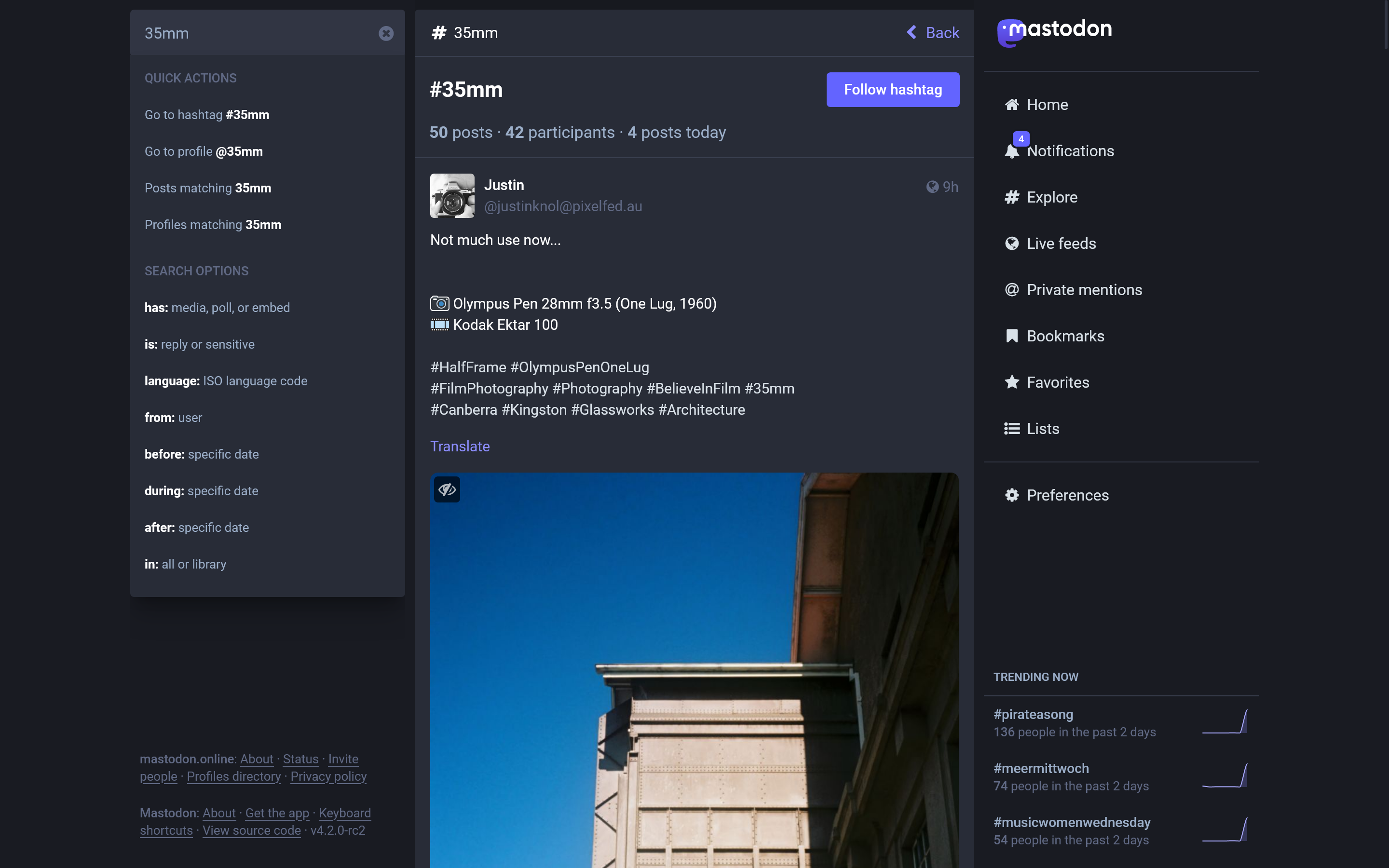
Now, as you type, a popout will provide you with quick actions such as the ability to go directly to a hashtag matching your query, the option to limit your search to user profiles, or, if writing or pasting in a URL, the ability to open the link in Mastodon.
Image Credits: Mastodon
Recent searches are also available for quick access and search results offer an infinite scroll.
Under the hood, Mastdon has also reworked and fine-tuned its data indexes to make searching for profiles more intuitive, allowing you to search for people by words in their bio, not just their names. Plus, to help you distinguish between real people and bots or impersonators, Mastodon will surface the verified links in its search results.
Image Credits: Mastodon
Image Credits: Mastodon
However, the biggest upgrade coming to search is one that takes aim directly at X and other Twitter competitors: at last, the ability to search for posts. Before, Mastodon content search
relied on hashtags.
You can also now use search operators to narrow down your search results, such as only retrieving posts that have an embedded link or a poll, or limiting results to those from a specific user, or posts that were published between specific dates.
Image Credits: Mastodon
Users can also configure their own privacy settings so they can control if they want their posts to show up in search results or the Explore page on an opt-in basis. That does mean users will have to switch this setting on to make search comparable to a larger network like X, but it’s a step in the right direction and one that protects user privacy.
Also new today is the newly polished web interface which adds things like more thread indicators, better article previews, and the removal of cropping from image previews.
But the bigger changes are those coming to onboarding — a process that’s often been dubbed too cumbersome and confusing for would-be users who want to try the open source, decentralized Twitter alternative. To address these concerns,
Mastodon recently improved the server selection process. Now, it’s also adding progress indicators to guide people through the sign-up process and rewrote the introductory copy to be less technical and confusing.
Image Credits: Mastodon
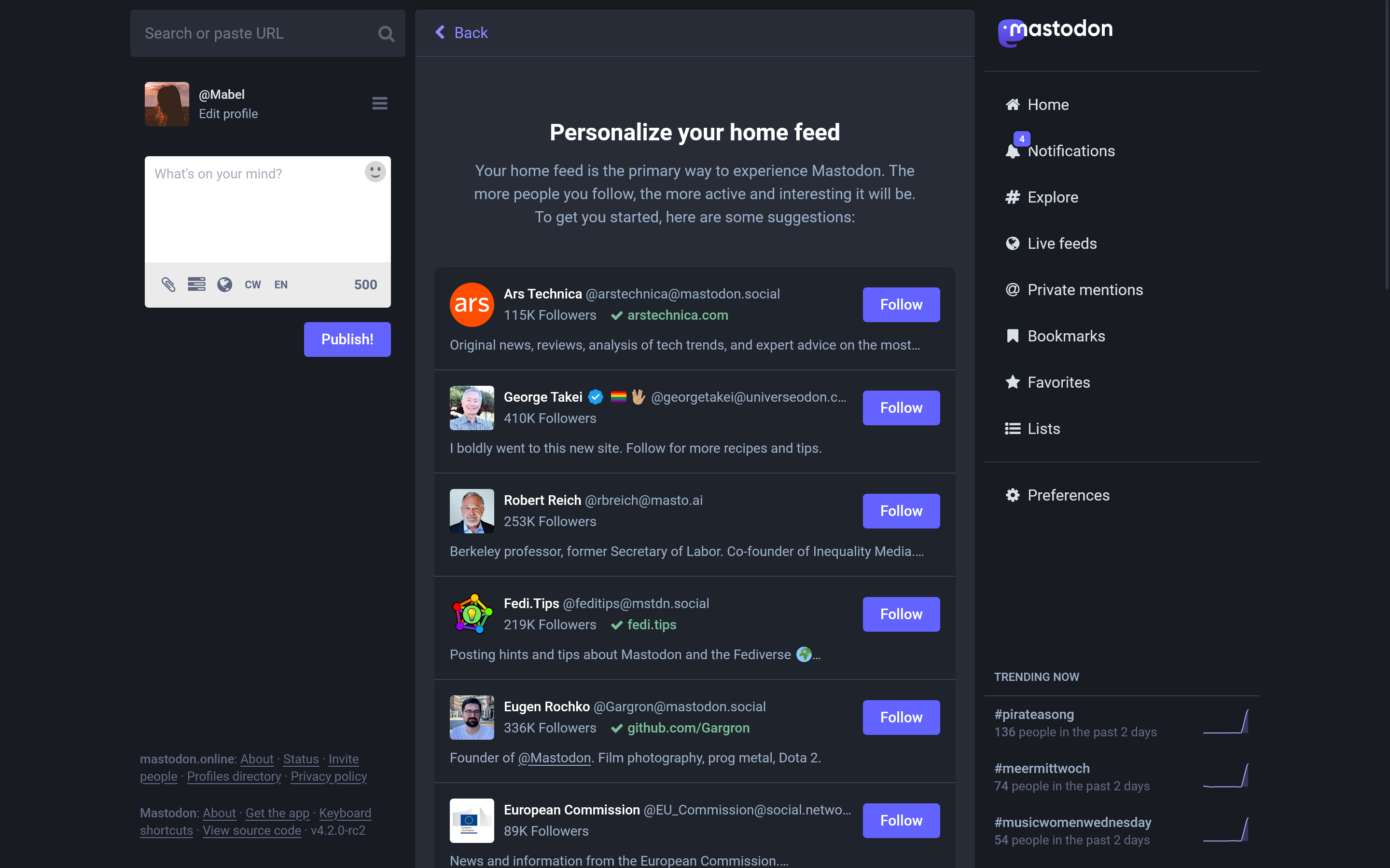
After getting logged in, new users are also pointed to recommended first steps — like filling out their profile, following people (with helpful suggestions), making their first post, and sharing their profile outside Mastodon.
Image Credits: Mastodon
Image Credits: Mastodon
After testing these changes on its own servers, Mastodon says it saw an increase in the average number of profiles a new user followed, which grew from 2.6 to 6.8.
Another change involves the logged-out experience — something that Twitter used to struggle with, too. There had been debate about whether Twitter’s logged-out experience
should help users view tweets or whether it should push them to sign up and log in.
On Mastodon, things work a little differently, though. You can end up on other Mastodon servers besides your own which means you’re effectively “logged out.” That has limited users from being able to perform certain actions, like following a new user. So users would have to copy and paste the URL of a profile in the search box of their own server in order to follow the user, which was confusing and complicated.
Image Credits: Mastodon
In the new experience, things are a little better though not as simple as on a centralized network like X or Threads. Now, you’ll be asked to type in the domain of your Mastodon home server, which autocompletes as you type, and then you’re redirected to the post or user profile from your logged-in interface, allowing you to take whatever action you intended.
While the above are the major updates in the 4.2 release there are dozens of other changes and fixes coming as well to features like search, polls, link cards, DMs, hashtags, replies, and more. Notably, DMs have been renamed private mentions to indicate they’re not actually equivalent to X’s DMs, for instance. Mastodon has also adopted the lines that X uses to connect reply chains.
Mastodon shared these and other top changes in 4.2, such as:
- Search results now load more results as you scroll, just like other feeds
- Search results are generally better in a lot of tiny technical ways
- Boosts no longer pollute the Posts and Replies tab on profiles
- Server administrators and custom role enjoyers have new badges on their profiles
- Link cards have a new design featuring more details
- Polls finally have a button to see results without voting
- Pictures and videos are no longer cropped to 16:9 in feeds
- Edit profile screen has been refurbished
- New Privacy and Reach tab to control all the privacy and reach preferences
- Dropdowns look fresher, dangerous options tinted red
- Bot be gone, it’s “Automated” profile now
- Media with alternative text now features ALT badge
- Reply chains are now connected with lines for easier reading
- Search can now be found more easily on small screens
- Clicking on links to posts in posts no longer takes you out of the interface
- Clicking usernames in people’s bios no longer takes you out of the interface
- Direct Messages now called Private Mentions for consistency
- Local and federated timelines have been moved to Live Feeds
- Hashtags at the end of posts now display as a hashtag bar
- Higher resolution and quality for uploaded images and videos
- Lots of minor color and typography adjustments to make Mastodon feel slick
- Lots of optimizations and performance improvements
- Posts on lists can now be excluded from your Home Feed so you don’t see them twice
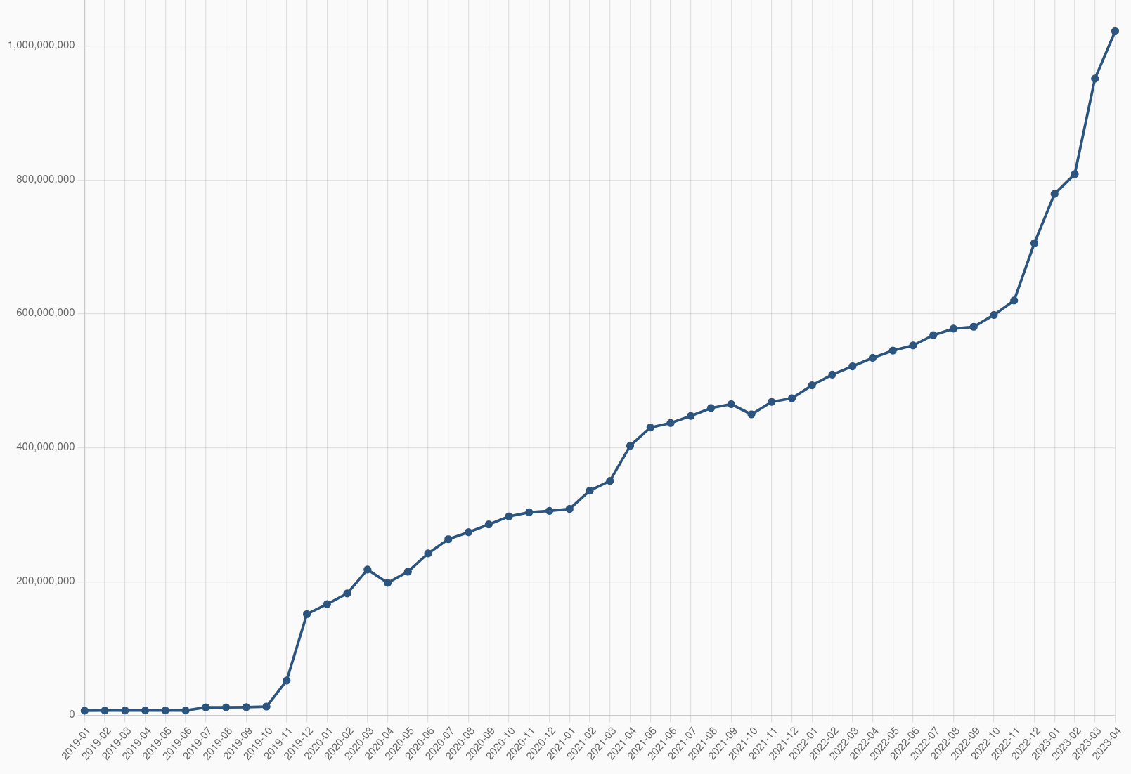
Mastodon’s network has grown quite a bit in the wake of Elon Musk’s acquisition of Twitter, now renamed X. Though Mastodon isn’t the only competitor to X — there’s also Bluesky, Threads, Post, Pebble (T2), Spill, and others — it does have an active user base of
currently around 1.7 million monthly actives. That number tends to rise and fall alongside X’s stumbles.
More importantly, however, is that the decentralization Mastodon promotes is becoming more mainstream. Instagram has
pledged to support the protocol powering Mastodon, ActivityPub, in its Threads app in the future. ActivityPub will also be adopted by smaller
social apps like Flipboard as well
as the larger blogging platform WordPress.
Mastodon 4.2 is available starting today, and its development is made possible through user donations through platforms like
Patreon and
Mastodon’s recent merch sales.


 blog.universeodon.com


 greasyfork.org