

Story
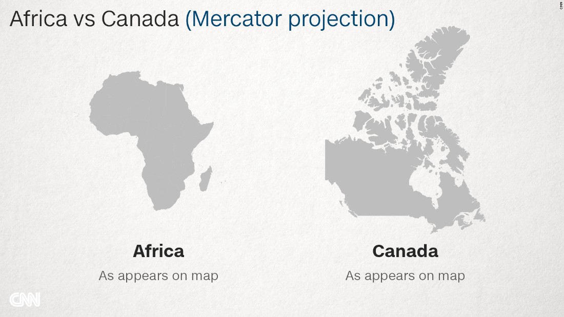
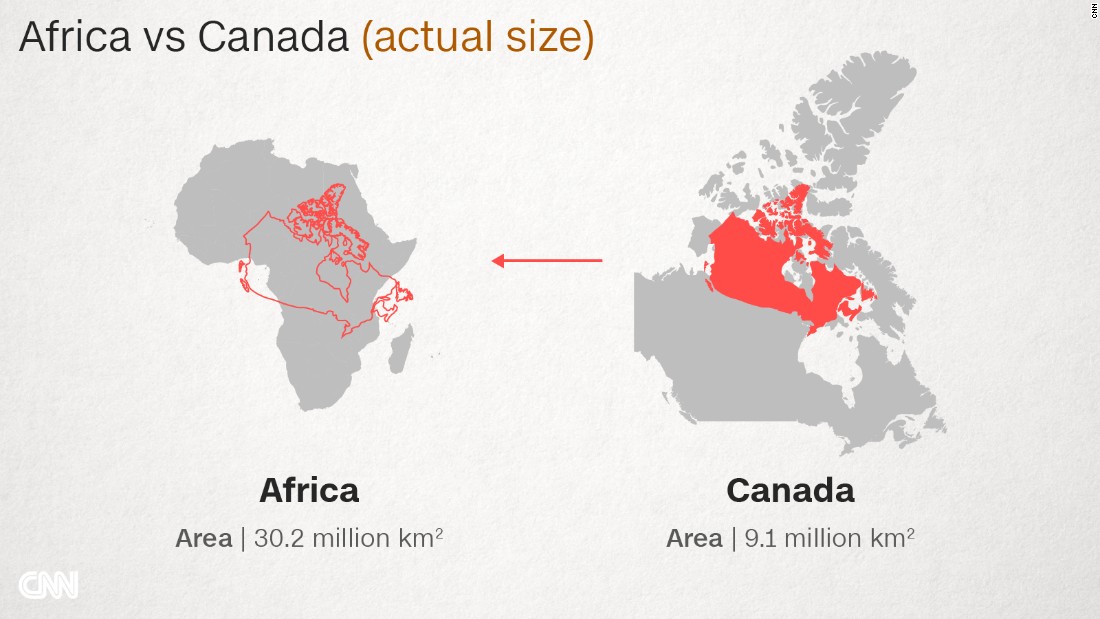
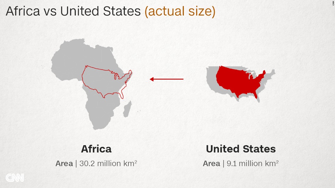
(CNN)On a typical world map, Canada is a vast nation. Home to six time zones, its endless plains spread from ocean to ocean, dominating great swathes of the northern half of the globe. But, in reality, three Canadas would comfortably fit inside Africa.
Our world map is wildly misleading. It's all down to the European cartographer Geert de Kremer, better known as Mercator, and his 16th century map projection -- a common template for world maps today -- which distorts the size of countries.
Now, schools in Boston are taking a stand against the tradition by introducing the lesser-known Peters projection from the 1970s (also called Gall-Peters projection) in classrooms, to teach children the real size of the continents.


The move is part of a wider initiative to remove bias within education.
"By incorporating the Peters projection maps -- an equal area representation -- into classrooms, we are opening the door for students to view the world in a different light," says Natacha Scott, social studies director at Boston Public Schools.
The initiative will see students comparing different maps.
"By exploring geography, we also hope to increase an awareness of the relationship between themselves to other countries, communities, cultures and individuals around the world," Scott adds.
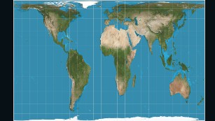
The Peters projection maps areas in their actual sizes relative to each other, but in doing so distorts their shapes.
Though a convenient way to chart the world, Mercator's map distorts proportions, making some landmasses larger that they are in reality.
"Somehow this map projection came to be used on most world maps, especially those produced for classrooms since the beginning of the 1900s," says Menno-Jan Kraak, president of the International Cartographic Association and professor of cartography at the University of Twente, Netherlands.
"Most of us have grown up with this world image."
Made for captains

The 1569 Mercator projection was made for navigating the seas -- drawing the meridians and parallels as straight lines that cross at right angles helped sailors to navigate some of the their first treacherous voyages around the world.
Mercator initially made globes. Later transferring his map from a three-dimensional curved surface to a flat sheet of paper was problematic. Taking the equator as the logical map center left big, confusing gaps near the poles.
Mercator's solution was to stretch out the northern and southern extremities of the globe to fill those gaps, producing an elegant and usable map.
While a revolutionary tool for captains and explorers, the projection distorts the relative size of the continents, to the advantage of the West.
The repercussions of this are still being felt today.
A map made by Europe for Europe
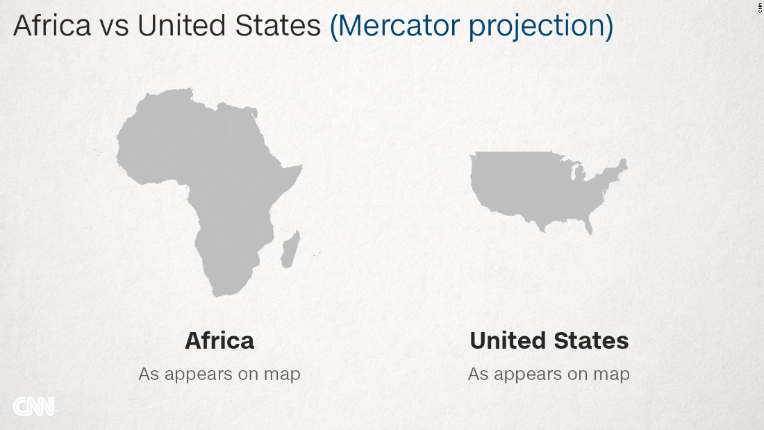
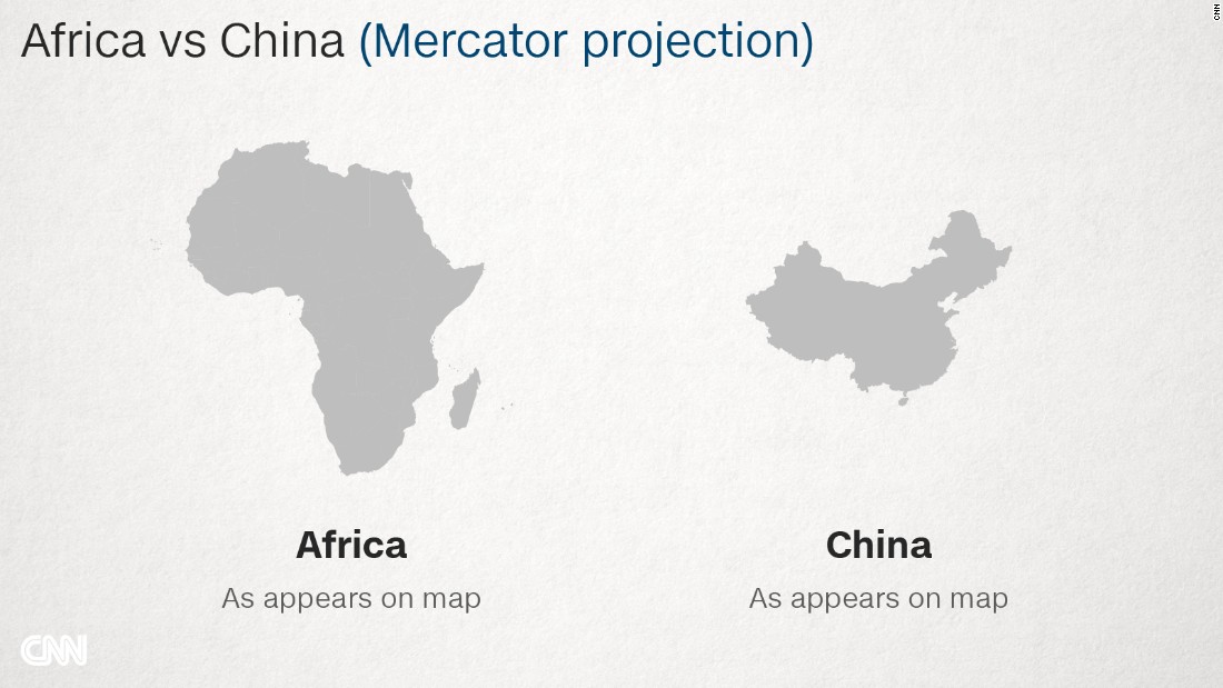
On the Mercator map, Africa -- sitting on the equator, reasonably undistorted -- is left looking much smaller than it really is.
But Canada, Russia, the United States and Europe are greatly enlarged.
The distortion is largest near the poles: Greenland, which looks about the same size as the whole of Africa on the Mercator, is a classic example. In truth, it is no bigger than the Democratic Republic of Congo.
That European and North American countries are enlarged is no accident. This system provided more space for Western cartographers to mark towns, cities, roads etc in their part of the world, Kraak says.
"If you would take a map projection with equal areas then there is almost no space on the map to display all [these details]."
There was, of course, much to map in Africa, too, but that mattered less to the cartographers up north, he adds.
A political tool?
One of the dangers of the Mercator map is that it can make enlarged countries seem unnaturally powerful and intimidating.
"The term 'power of representation and representation of power' sums up quite well how maps and the rise of the Western nation-state system -- and with that, empire and colonialism -- are linked," says Marianne Franklin, professor of Global Media and Politics at Goldsmiths, University of London.

Was subsequent European imperialism perhaps spurred on by a map projection that reinforced the notions of self-importance held by those nations?
"The world maps that prevail today have been embedded in Western imaginations since the British empire. They continue (to prevail) despite many challenges to their fairness and accuracy because they underpin the ongoing Anglo-Euro-American presumption that the world belongs to them, and pivots around these geo-cultural axes," Franklin says.
In more recent times, maps have been used for propaganda, adds Kraak.
Take Russia, for example.
"If you take the Mercator projection, where Russia looks huge, give it a bright red color and then compare it to the rest of Europe, you see how dangerous it can look," says Kraak.
No perfect map
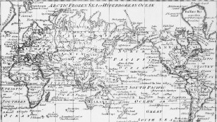
Chart of the world as per Mercator's projection, circa 1798, with the most recent discoveries.
Sadly, there is no such thing as a perfect map. Because the earth is a sphere -- more of a potato-shape, in fact -- it is impossible to map it on a flat surface without errors in proportion, explains Kraak.
Also the Peters projection has its flaws. In order to show the actual size of land masses, their shapes are distorted.
Boston Public Schools are rolling out the new maps in all second, seventh and eleventh grades for now, and aim to place them in all classrooms in the future.
Other alternative maps are being introduced around the world too. In the US and Germany, for example, maps based on the so-called Winkel Tripel projection, which has a smaller skewness, started to replace the Mercator in the 1920s.
A digital boost
But the Mercator still dominates and the digital revolution has further strengthened its position.
Today the Mercator projection is used as a template at Google Maps, OpenStreetMap and Bing, says Kraak.
From guiding 16th century explorers on the high seas to helping people find Pokemons on their smartphones, Mercator's work continues to influence how people see the world centuries after his death.


 "
" 
