Anyone have that map that shows red states get more in federal aid than blue states?

Serious

Veteran
Supporter
Joined
Apr 30, 2012
Messages
80,106
Reputation
14,307
Daps
190,769
Reppin
1st Round Playoff Exits
Oh yeah gundumb while we're at it:
map-of-obesity-rates.jpg

Obesity accounts for 21 percent of U.S. health care costs, study finds

http://www.sciencedaily.com/releases/2012/08/120820160851.htm
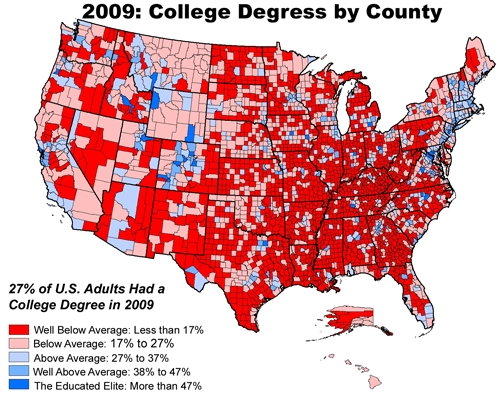


college_degrees_county.jpg


But let me guess, all those obese and uneducated people in the south are black right :beli:

I guess this guy was about to be the next astrophysicist. :stopitslime:

tumblr_mdj7j7jVX41ra1uur.jpg

Hello There, Racists! - Cameron Benjamin Mason -- Sebree, Kentucky
 

Brown_Pride

All Star
Joined
Jun 8, 2012
Messages
6,416
Reputation
785
Daps
7,887
Reppin
Atheist for Jesus
129099282207642436.jpg


It honestly sounds like Gundumb might be out there somewhere trying to put the good fight up. SO i'm not gonna lay in but give him some solid advice on how to handle that argument.

First look at the state population based on race, in those states...white make up the majority

Look at the overall number of people on welfare...by race. Whites make up the majority there too simply based on population.

THE ONLY VALID FACT BASED POINT someone can make is that as a portion of their race blacks and hispanic have a higher rate of beign on welfare...however....

The argument concerning welfare typically runs around MONEY.

SO when you get right down to brass tax the united states of america pays more tax dollars to white americans over any other group of people.

A percent argument is moot.
 
Top