We just disagree I guess

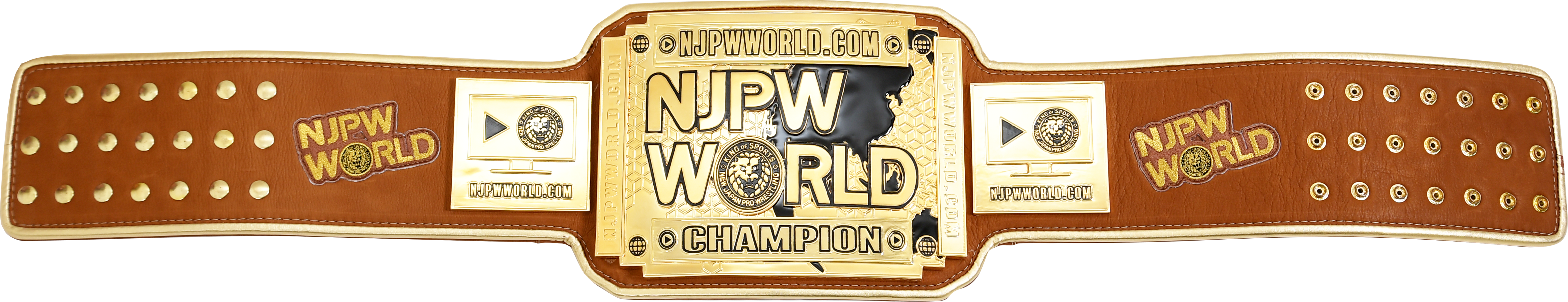
Every boxing and fighting belt everywhere showcases the name or logo of the organization, other than NWA and NJPW really
It ain't about the logo being prominent or being showcased, it's that there is literally no design to the belt
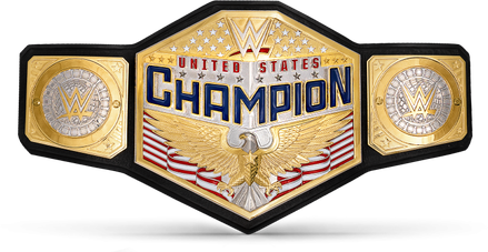
Like the new version of the WHC has a big ass logo on it too but at least there's an actual design around it
The logo belt also been around 10 years and they've rehashed it 7 damn times (original, Undisputed, women's undisputed, women's smackdown, women's raw, red universal, blue universal)
You could actually say 8 times if you count the scratch logo version that replaced the awful spinner


 edit:
edit: