OfTheCross
Veteran

We eating!
You can play with the numbers using this tool:

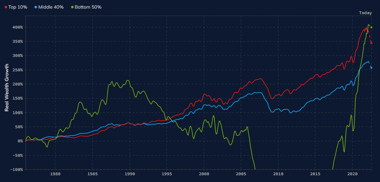
Middle-Class wealth has also gone up about 300% in that time


 Capitalism...
Exactly these charts mean nothing in a vacuum.How about the cost of living? Cost of goods? You got charts for that?
Some of y'all asking questions but not providing actual information. smh

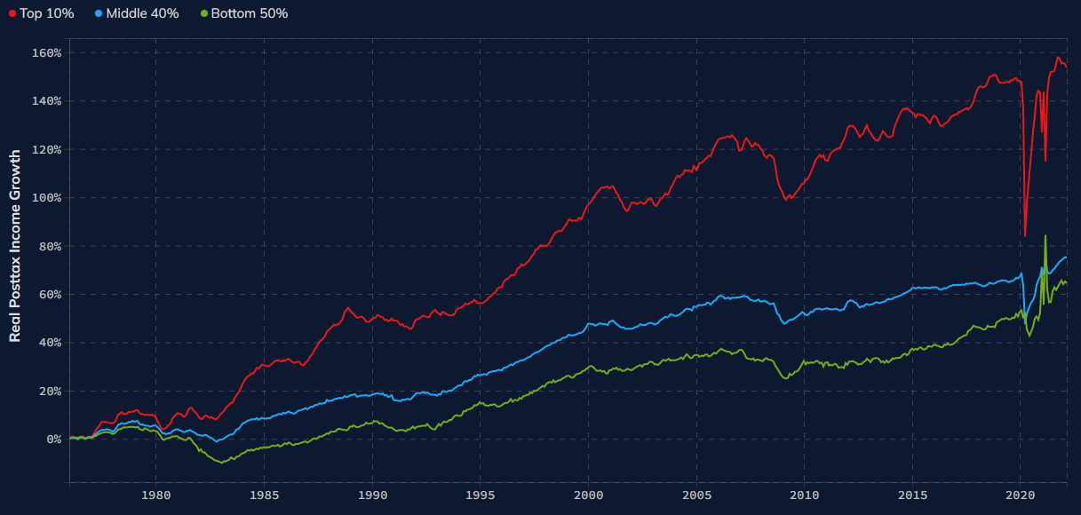
Well one thing that I can tell from the chart is that the top 10% have pulled away from the rest of the pack like a motherfukker since the 1980s
Capitalism...

Wages adjusted for inflation. Trying to show how much you can buy with a wage instead of just it's nominal value. Say we take 1980 as the base year with a price level of 1 and say wages are $10/h. Say in 2022 wages are $30/h. This doesn't tell us how much we can buy because we haven't considered the price level. If the price level has risen to 3 (i.e. prices today are 3 times what they were in 1980) then real wages are 30/3=$10/h. Even tho wage have nominally increased (i.e. $30/h > $10/h) you can only buy the same amount of stuff as you could in 1980. If the price level only rose to 1.5 then real wages are now 30/1.5=$20/h then we can now buy twice as much stuff as we could of in 1980.Whats the term, real wages?

