88m3
Fast Money & Foreign Objects
Visualizing the Spanish city in bike-share maps, taxi routes, tweets, and more.
The trio's atNight project offers a fresh presentation of social media activity and open data collected across Barcelona after dark. They hope the project leads to insights about when, where, and how city folks interact with their environment—and perhaps even helps urban planners design the city more intuitively. But the images can be enjoyed in their own right, too. Let's take a look.
This first map superimposes locations of personal tweets (the little spots) onto nighttime routes of Barcelona buses (the fuzzy lines) to examine the contrast between collective and individual behavior. It demonstrates how individual activity is sprinkled around the arteries and veins of the city.
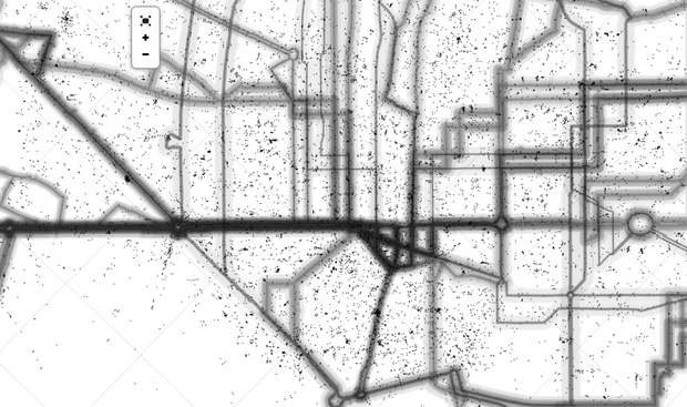
The map superimposes the number of riders in each night bus with geolocated tweets to show points of convergence between individuals and groups. (atNight)
This next map is inspired by this "tree, cab and crime" map of San Francisco. The creators use Google Places to pinpoint "safe" places to let loose when the sun goes down. (Note: They define "safe" as spaces under surveillance.) Cyan dots represent parties, magenta ones are food joints, and yellow ones are where the cameras are.
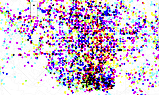
Recreational hotspots and zones under surveillance mapped by hour, using geo-referenced activities. (atNight)
Each dot on the next map represents a business—restaurants, offices, pubs, bookstores, etc. The size of the point depends on the opening time; the bigger the dot, the later the place opens.

By overlapping activities geo-referenced in Google Places by type of establishment and hour, the developers map when businesses switch on their lights. (atNight)
In the next few maps, the atNight team used transportation data to look at how people experience the city at different speeds and by different means of movement. The first shows the concentration of bikes in Barcelona's bike-share docks during day (orange dots) and night (blue); the second visualizes Barcelona's taxi fleet activity; and the third illustrates how people move in public and private spaces by layering density data with taxi routes.
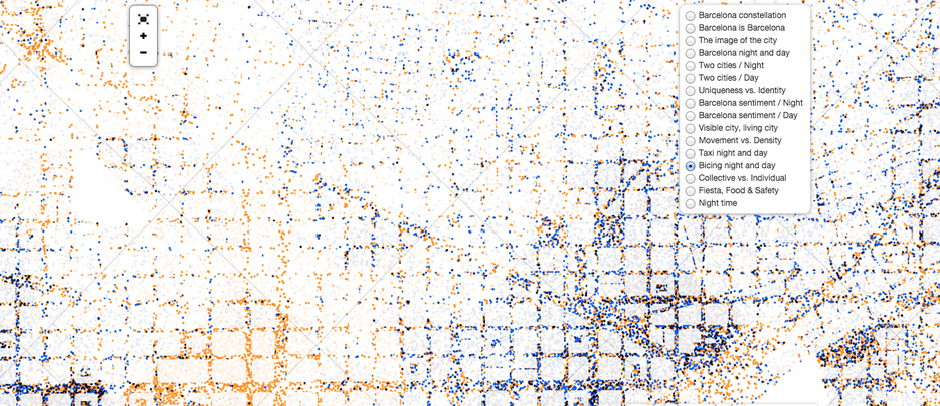
Using the numbers of bike in a city bike-share station per hour, this map represents the daytime and nighttime cycling activity around the city. (atNight)

This map uses geolocated itineraries from the Barcelona taxi fleet to understand what routes people take during the day and at night. (atNight)
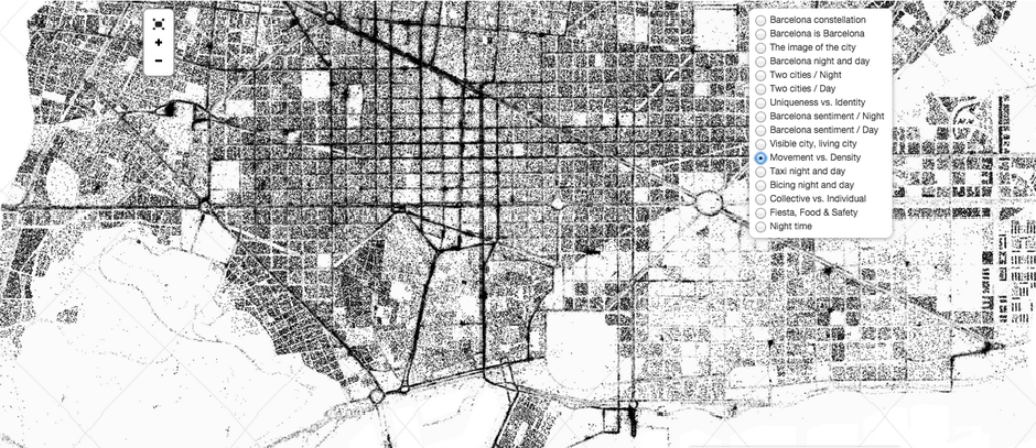
A combination of the population density per block and taxi fleet activity shows where people are and where they're heading. (atNight)
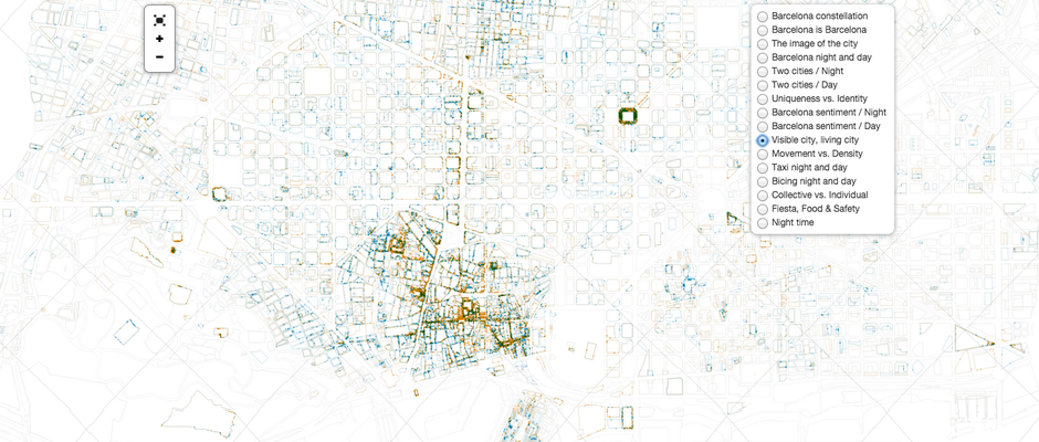
This next map may be the weirdest of the group, visually speaking. It represents social media activity by block. Daytime activity is in red and nighttime in blue. When there is activity at both times, the outline is in white, explains Díez. The width of each block varies to represents the volume of social interactions. So we can see that certain areas and buildings are more active on social media than others, and some people just go around the clock.

Social media interactions mapped on urban architecture and spaces. (atNight)
The rest of the maps rely heavily on how social media expressions shape the city: how people's tweets relate to the city's geography, what the language in their messages says about them, and how the photos they post represent the city.
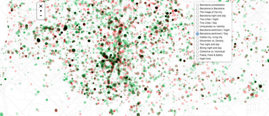
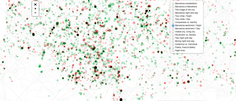
These two maps represent the city abstractly—not with boundaries, landmarks and coastlines, but through the tone of social media activity that changes from day to night. Using an algorithm measuring the positive and negative tone of the social media message, the developers note Barcelona was happier at night (or at least tweeted happier things). (atNight)

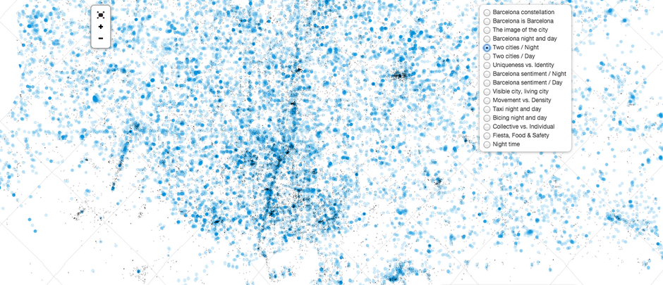
The two maps above compare geolocated images on Flickr and Instagram with registered locations on Twitter, in the day (in orange) and at night (in blue). The point is to see the overlap between what people take photos of and where they are, geographically. (atNight)
This map is straightforward: it looks at what features of the city are most captured on Flickr and Instagram, at what time. (atNight)
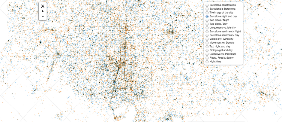
In this map, you can see the greater concentration of people taking photos around the city center and other key public places during the day. At night, however, that activity dissipates. (atNight)
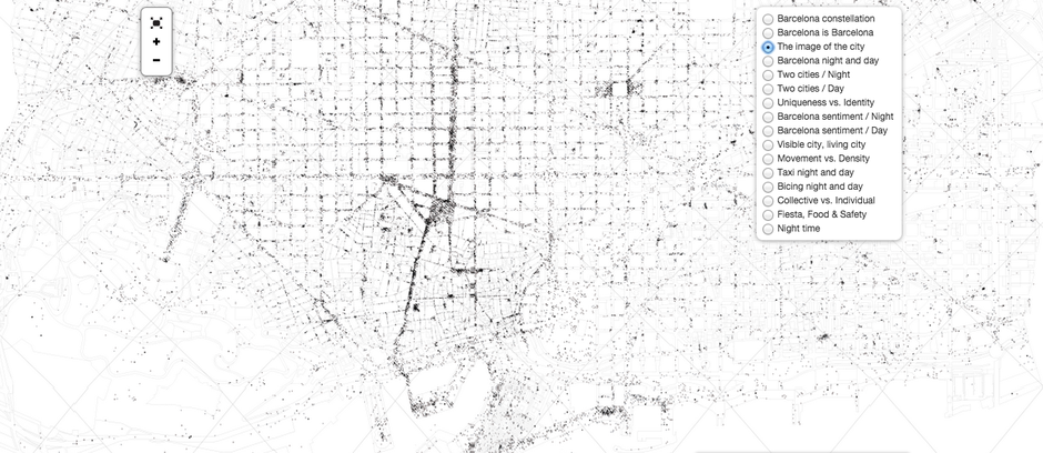
Understandably, most of these photos were taken around famous monuments and large public spaces. (atNight)
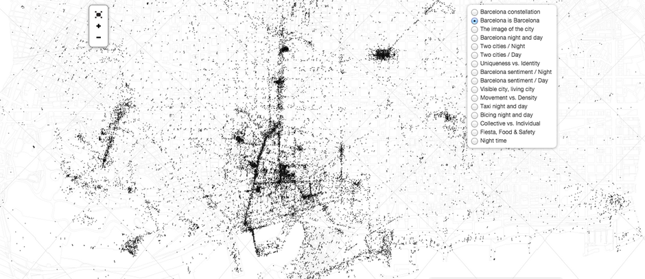
Analyzing tweets and Instagrams with the hashtag "#Barcelona," the creators mapped what areas social media users thought represented the city most. (atNight)
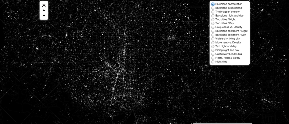
At first glance, this map might seem like a satellite image of the city, but it's actually all the tweets, Flickr uploads, and Instagrams lit up. (atNight)
Explore the data behind the maps here.
http://www.brickunderground.com/blog/2015/02/nyc_apartment_sale_timeline
- TANVI MISRA
- @Tanvim
- 4:35 PM ET
- Comments
The trio's atNight project offers a fresh presentation of social media activity and open data collected across Barcelona after dark. They hope the project leads to insights about when, where, and how city folks interact with their environment—and perhaps even helps urban planners design the city more intuitively. But the images can be enjoyed in their own right, too. Let's take a look.
This first map superimposes locations of personal tweets (the little spots) onto nighttime routes of Barcelona buses (the fuzzy lines) to examine the contrast between collective and individual behavior. It demonstrates how individual activity is sprinkled around the arteries and veins of the city.

The map superimposes the number of riders in each night bus with geolocated tweets to show points of convergence between individuals and groups. (atNight)
This next map is inspired by this "tree, cab and crime" map of San Francisco. The creators use Google Places to pinpoint "safe" places to let loose when the sun goes down. (Note: They define "safe" as spaces under surveillance.) Cyan dots represent parties, magenta ones are food joints, and yellow ones are where the cameras are.

Recreational hotspots and zones under surveillance mapped by hour, using geo-referenced activities. (atNight)
Each dot on the next map represents a business—restaurants, offices, pubs, bookstores, etc. The size of the point depends on the opening time; the bigger the dot, the later the place opens.

By overlapping activities geo-referenced in Google Places by type of establishment and hour, the developers map when businesses switch on their lights. (atNight)
In the next few maps, the atNight team used transportation data to look at how people experience the city at different speeds and by different means of movement. The first shows the concentration of bikes in Barcelona's bike-share docks during day (orange dots) and night (blue); the second visualizes Barcelona's taxi fleet activity; and the third illustrates how people move in public and private spaces by layering density data with taxi routes.

Using the numbers of bike in a city bike-share station per hour, this map represents the daytime and nighttime cycling activity around the city. (atNight)

This map uses geolocated itineraries from the Barcelona taxi fleet to understand what routes people take during the day and at night. (atNight)

A combination of the population density per block and taxi fleet activity shows where people are and where they're heading. (atNight)
This next map may be the weirdest of the group, visually speaking. It represents social media activity by block. Daytime activity is in red and nighttime in blue. When there is activity at both times, the outline is in white, explains Díez. The width of each block varies to represents the volume of social interactions. So we can see that certain areas and buildings are more active on social media than others, and some people just go around the clock.

Social media interactions mapped on urban architecture and spaces. (atNight)
The rest of the maps rely heavily on how social media expressions shape the city: how people's tweets relate to the city's geography, what the language in their messages says about them, and how the photos they post represent the city.


These two maps represent the city abstractly—not with boundaries, landmarks and coastlines, but through the tone of social media activity that changes from day to night. Using an algorithm measuring the positive and negative tone of the social media message, the developers note Barcelona was happier at night (or at least tweeted happier things). (atNight)


The two maps above compare geolocated images on Flickr and Instagram with registered locations on Twitter, in the day (in orange) and at night (in blue). The point is to see the overlap between what people take photos of and where they are, geographically. (atNight)

This map is straightforward: it looks at what features of the city are most captured on Flickr and Instagram, at what time. (atNight)

In this map, you can see the greater concentration of people taking photos around the city center and other key public places during the day. At night, however, that activity dissipates. (atNight)

Understandably, most of these photos were taken around famous monuments and large public spaces. (atNight)

Analyzing tweets and Instagrams with the hashtag "#Barcelona," the creators mapped what areas social media users thought represented the city most. (atNight)

At first glance, this map might seem like a satellite image of the city, but it's actually all the tweets, Flickr uploads, and Instagrams lit up. (atNight)
Explore the data behind the maps here.
http://www.brickunderground.com/blog/2015/02/nyc_apartment_sale_timeline