thernbroom
Superstar
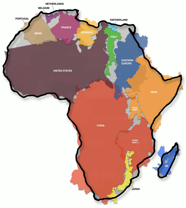
The map shows how Africa (30,3 million km²) is larger than the combination of China (9,6 million km²), the US (9,4 million km²), Western Europe (4,9 million km²), India (3,2 million km²) and Argentina (2,8 million km²), three Scandinavian countries and the British Isles (map gives no surface for these last two areas).
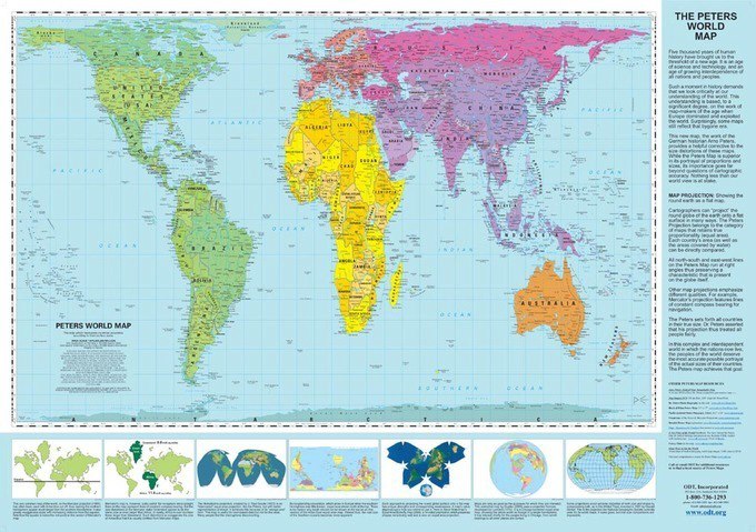
The Peters Projection World Map is one of the most stimulating, and controversial, images of the world. When this map was first introduced by historian and cartographer Dr. Arno Peters at a Press Conference in Germany in 1974 it generated a firestorm of debate. The first English-version of the map was published in 1983, and it continues to have passionate fans as well as staunch detractors.
We all know this;
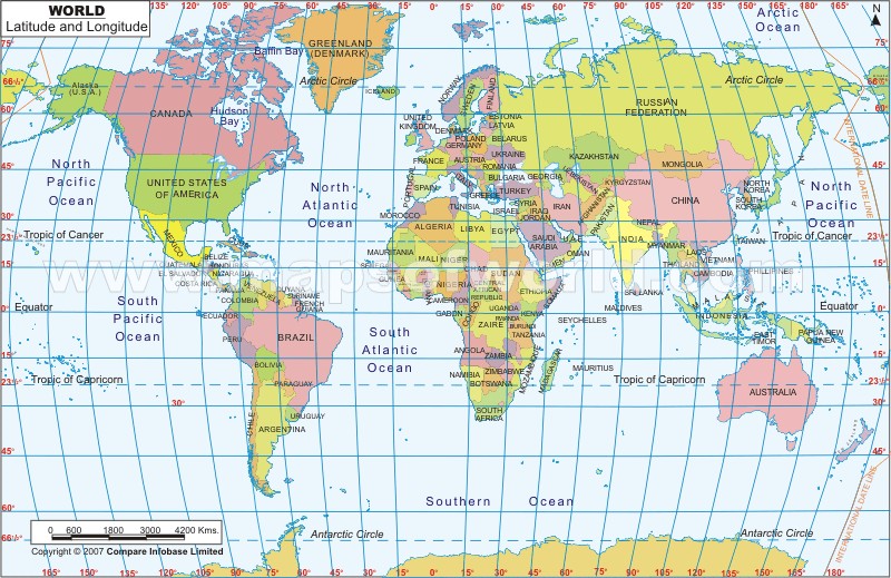
But, in proper proportions, this one is much, much more accurate;
And just to throw you for a loop;
The Peters Projection World Map is one of the most stimulating, and controversial, images of the world. When this map was first introduced by historian and cartographer Dr. Arno Peters at a Press Conference in Germany in 1974 it generated a firestorm of debate. The first English-version of the map was published in 1983, and it continues to have passionate fans as well as staunch detractors.

We all know this;

But, in proper proportions, this one is much, much more accurate;

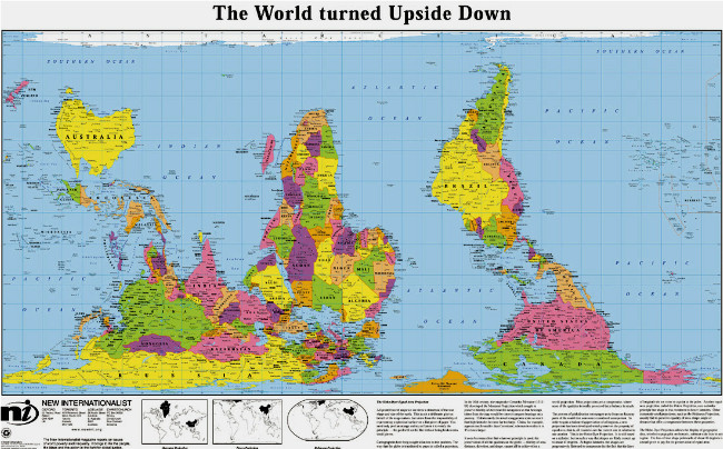
And just to throw you for a loop;


 i guess thats why china has such great interest
 How many "coincidences" need to happen for nikkaz to recognize the trend towards mental manipulation?